Color Trends
Pantone Color of the Year 2026: How to Use Cloud Dancer
A practical guide to PANTONE 11-4201 Cloud Dancer, the warm off-white chosen as Pantone Color of the Year 2026, with palettes, use cases, and approval tips.
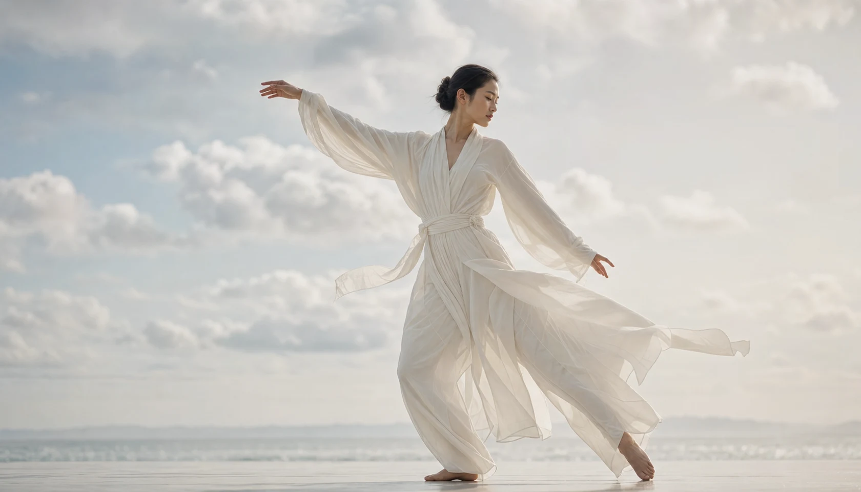
Pantone Color of the Year 2026 is PANTONE 11-4201 Cloud Dancer, a soft white that is quiet enough to feel surprising. After years of color announcements built around obvious drama, Cloud Dancer makes a different argument: restraint can be expressive when the world around a design is loud.
That does not mean the choice is empty or easy. Near-white colors are demanding because every undertone, material, shadow, and neighboring color becomes visible. Used well, Cloud Dancer can make a palette feel lighter, calmer, and more intentional. Used carelessly, it can disappear or read as unfinished.
What Is Cloud Dancer?
Pantone introduced PANTONE 11-4201 Cloud Dancer on December 4, 2025 as the Color of the Year for 2026. It sits in the Fashion, Home + Interiors system and reads as a warm, airy off-white rather than an optical white. That warmth matters: it keeps the color closer to natural cotton, paper, ceramic, and daylight than to a cold screen-white interface.
| Reference | Value | Practical note |
|---|---|---|
| Pantone name | PANTONE 11-4201 Cloud Dancer | Use the official Pantone reference when discussing the color with product, textile, or material partners. |
| Pantone code | 11-4201 TCX | Best treated as an FHI textile-oriented reference, not a generic CSS color name. |
| Approximate HEX | #F0EEE9 | Useful for digital mockups on ColorToco, but not a substitute for a physical color standard. |
| Approximate RGB | 240, 238, 233 | A screen preview only; appearance changes with display calibration and surrounding color. |
| Color character | Warm off-white | Soft, neutral, and flexible enough to support stronger accent colors. |
Why a White Wins in 2026
A white Color of the Year sounds simple until you look at the cultural signal behind it. Cloud Dancer points toward clarity, reset, and lower visual pressure. In branding, interiors, fashion, and packaging, that can be powerful because the color gives the eye a place to rest.
It is also a useful correction to the idea that a trend color must be loud to be meaningful. Designers often need colors that organize a system rather than dominate it. Cloud Dancer works as a structural color: it can hold a layout together, soften contrast, and create a sense of space around stronger hues.
Designing with a Near-White
The biggest mistake is treating Cloud Dancer like a default background. It needs deliberate contrast, texture, and lighting so the viewer understands that the shade was chosen, not left blank.
- Pair it with deeper neutrals when legibility matters, especially in interfaces, packaging, labels, and editorial layouts.
- Use texture to make the color visible: cotton, uncoated paper, matte ceramic, woven fabric, plaster, and molded fiber all give the white a surface voice.
- Watch the light source. Warm bulbs can turn Cloud Dancer creamier, while cool LEDs can flatten its warmth.
- Do not place it beside pure white without a reason. A brighter white can make Cloud Dancer look aged or dirty.
- Document the intended substrate because the same off-white feels different on textile, paper, plastic, paint, and digital screens.

Where Cloud Dancer Works Best
| Use case | Why it works | What to check |
|---|---|---|
| Brand systems | Creates a quiet base for typography, photography, and accent colors | Contrast ratios, logo visibility, and the difference from pure white |
| Packaging | Suggests softness, quality, calm, and material honesty | Shelf lighting, embossing, varnish, and substrate color |
| Interiors | Makes rooms feel open without the coldness of stark white | Undertones across daylight, warm bulbs, and shadowed corners |
| Fashion | Works with flowing fabric, crisp shirting, knitwear, and tonal layering | Transparency, garment care, and how the white shifts beside skin tones |
| Digital UI | Can soften dense product interfaces and editorial pages | Text contrast, border visibility, and state colors for buttons and controls |
Palette Ideas
Cloud Dancer is most interesting when it does a job. Make it the canvas, then choose accents that clarify the mood instead of fighting the softness.
| Palette role | Suggested direction | Effect |
|---|---|---|
| Anchor | Cloud Dancer / #F0EEE9 | A warm, low-noise base that keeps the system breathable |
| Contrast | Charcoal / #1F2326 | Adds legibility and a premium editorial edge |
| Cool accent | Powder blue / #B9CFE0 | Keeps the palette airy without becoming sterile |
| Natural accent | Sage / #A6B29B | Connects the off-white to organic materials and interiors |
| Warm accent | Soft clay / #B98268 | Adds human warmth for fashion, beauty, and lifestyle contexts |
Cloud Dancer Approval Checklist
- Confirm whether you need the TCX textile reference, a paper reference, or a production-specific material sample.
- Review the color beside pure white, black, and the strongest accent in the palette.
- Test legibility for all text, icons, borders, and interaction states placed on top of the color.
- Check a physical sample under the lighting where the product or space will actually be seen.
- Write down the approved reference, approximate digital values, substrate, finish, and lighting assumptions.
Common Mistakes to Avoid
- Using Cloud Dancer as a generic white fill without checking contrast or material behavior.
- Assuming one HEX value can represent the color across screens, textiles, packaging, and paint.
- Pairing it only with pale colors, which can make the full palette feel washed out.
- Forgetting accessibility in digital applications where off-white backgrounds still need strong foreground contrast.
- Approving the color from a glossy render without a physical sample or proof.
FAQ
Is Pantone Cloud Dancer just white?
No. It is a warm off-white with a softer character than pure optical white. The difference is subtle, but it becomes important when the color is used on fabric, paper, packaging, interiors, or UI backgrounds.
What is the closest HEX value for Cloud Dancer?
ColorToco uses #F0EEE9 as an approximate digital value for the PANTONE 11-4201 TCX record. Treat it as a screen preview, not an official production specification.
Can Cloud Dancer work as a brand color?
Yes, but it needs support. Use it as a base or structural color, then define darker typography, accent colors, and material rules so the brand does not lose recognition or accessibility.
Sources
- Pantone Color of the Year 2026: PANTONE 11-4201 Cloud DancerPantone
- Pantone announces Color of the Year 2026: PANTONE 11-4201 Cloud DancerPantone
- Pantone's Color of the Year for 2026 Is a 'Blank Canvas' Called Cloud DancerSmithsonian Magazine
- Color of the Year 2026 x Jensen ArabiqueMonotype
- Pantone Chooses White as its Color of the Year for the First Time EverTIME