Editorial color profile
Meaning, applications, and color guidance
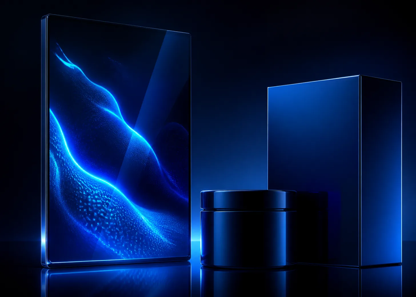
PANTONE 2738 C is approached here as an electric deep blue with two distinct roles: a luminous interface concept and a glossy package concept. Shared geometry and hierarchy connect those applications without demanding visual identity.
A luminous interface sits beside glossy packaging in the application concept, supported by violet, cyan, and near-black structure. The blue remains the recognizable center while each medium receives its own approval path.
The HEX, RGB, and application image shown here are screen approximations. Use a current physical Pantone reference as the production target.[1]
Key color facts
- Pantone's Color Finder identifies the PANTONE 2738 C reference. The official physical reference is the production target, while this page provides an approximate digital view.[1]
- For the catalog HEX approximation: Calculated contrast with white: 14.94:1.
- WCAG 2.2 Success Criterion 1.4.3 uses thresholds of 4.5:1 for normal text and 3:1 for large text, calculated from the final foreground and background values.[2]
- The phrase electric blue is an editorial description chosen for this profile. Use it to direct mood and hierarchy rather than to imply a technical property.
Calculated screen contrast
#06038D
- Relative luminance
- 0.020
- Black contrast
- 1.41:1
- White contrast
- 14.94:1
Recommended use cases
Luminous interface
Use the blue for a focused dashboard region, selected navigation state, or full-screen moment, then separate information with white and pale cyan. A near-black frame can intensify the color without adding more saturated accents.
Consideration: Calculate contrast for every implemented state, including dimmed, disabled, and overlay treatments. The profile's ratio applies only to the catalog HEX approximation paired with the named foreground.[2]
Glossy package focus
Concentrate 2738 C on one broad package face or inner reveal, with black-violet edges and a pale information panel. Limiting the bright companions keeps the package from becoming a collection of competing effects.
Consideration: Judge the actual package proof beside a current physical Pantone reference. This screen image cannot specify the result of a substrate, coating, ink build, or viewing condition.[1]
Screen-to-object system
Connect interface and package through shared geometry, spacing, and a limited accent family rather than demanding an identical appearance. The blue can remain the recognizable center while each medium receives its own approval path.
Consideration: Document screen tokens and physical production references separately. Review them together for coherence, but do not use a browser screenshot as the acceptance sample for the manufactured object.
Color palette ideas
Electric Interface
Electric Blue
#06038D
Night Frame
#11111A
Ice Cyan
#A9E7F0
Clear White
#FFFFFF
Electric Blue: Own the selected panel or immersive interface moment.
Night Frame: Build the surrounding shell and inactive regions.
Ice Cyan: Highlight data, focus, and concise secondary cues.
Clear White: Carry primary labels after exact contrast testing.
The dark frame gives the blue a luminous presence, while cyan provides a cooler step for selected data. White remains the clearest information color when the final pairing passes.
Glossy Depth
Package Blue
#06038D
Black Violet
#21152F
Cool Silver
#B5BDC8
Magenta Spark
#BB2C83
Package Blue: Lead the primary face and memorable inner reveal.
Black Violet: Deepen edges without abandoning chromatic character.
Cool Silver: Open a material-toned information zone.
Magenta Spark: Mark one compact accent or edition detail.
Black violet extends the blue into shadow, and silver supplies an intentionally quiet break. A very small magenta accent adds energy without overtaking the package hierarchy.
Signal Spectrum
Signal Blue
#06038D
Ultraviolet
#5D35B1
Aqua
#19B8C5
Soft Gray
#D8DAE2
Signal Blue: Connect the interface and physical object family.
Ultraviolet: Create a neighboring state or secondary panel.
Aqua: Identify a contrasting function or data stream.
Soft Gray: Provide a stable neutral field around saturated colors.
Violet and aqua expand the energetic range while preserving cool continuity. Soft gray creates enough quiet space for those saturated roles to remain understandable.
Production guidance
- Specify PANTONE 2738 C with a current physical Pantone guide or reference. Treat HEX, RGB, and the concept image as approximate digital translations rather than physical standards.[1]
- Maintain separate acceptance references for the interface and the physical package. Ask them to express one art direction, but allow each medium to be evaluated through its own actual output.
- Review a full package proof with the pale panel, dark edges, and any accent present. Adjust proportions before adding effects, because the blue already supplies a strong visual center.
- For interface typography, calculate contrast against every final background value and test normal and large text at the WCAG 2.2 thresholds. Include interactive and overlay states in that review.[2]
Application example
Frequently asked questions
Will PANTONE 2738 C look the same on screen and packaging?
Do not expect the experiences to be identical. Use this HEX and RGB view for approximate screen planning, then approve the physical package against a current Pantone reference and actual production proof.
Can white text sit on the 2738 C digital approximation?
The calculated ratio is a useful starting point, but the final decision must use the implemented background, type size, weight, and states. Test the complete interface under WCAG 2.2.
How can one system connect screen and physical color?
Share geometry, hierarchy, spacing, and a controlled companion palette. Keep separate screen tokens and physical approval references so both outputs can feel related without being judged by an impossible identical-match rule.
Sources
Publisher: Pantone.
Accessed August 6, 2026.
Web Content Accessibility Guidelines (WCAG) 2.2
Publisher: World Wide Web Consortium.
Published October 5, 2023. Accessed August 6, 2026.