Editorial color profile
Meaning, applications, and color guidance
PANTONE 347 C is treated here as an energetic green with enough visual weight for sports materials, product labeling, and focused interface accents. Its clearest role is active and direct rather than soft or botanical.
Green can suggest many ideas, but color alone does not prove environmental, health, ingredient, or sustainability claims. These examples keep messaging literal, use explicit labels, and give every green field a clearly defined communication role.
The HEX, RGB, and application image shown here are screen approximations. Use a current physical Pantone reference as the production target.[1]
Key color facts
- Pantone's Color Finder identifies the PANTONE 347 C reference. The HEX, RGB, and concept image shown on this page are screen approximations, not replacements for a current physical Pantone guide or approved sample.[1]
- WCAG 2.2 Success Criterion 1.4.3 requires a contrast ratio of at least 4.5:1 for normal text and 3:1 for large text, measured from the final color values.[2]
- This editorial profile uses 347 C to communicate pace, category, and focus. It intentionally avoids treating a green surface as evidence for any product benefit or responsible practice.
- For the catalog HEX approximation: Calculated contrast with white: 3.68:1.
Calculated screen contrast
#009A44
- Relative luminance
- 0.235
- Black contrast
- 5.71:1
- White contrast
- 3.68:1
Recommended use cases
Sports materials
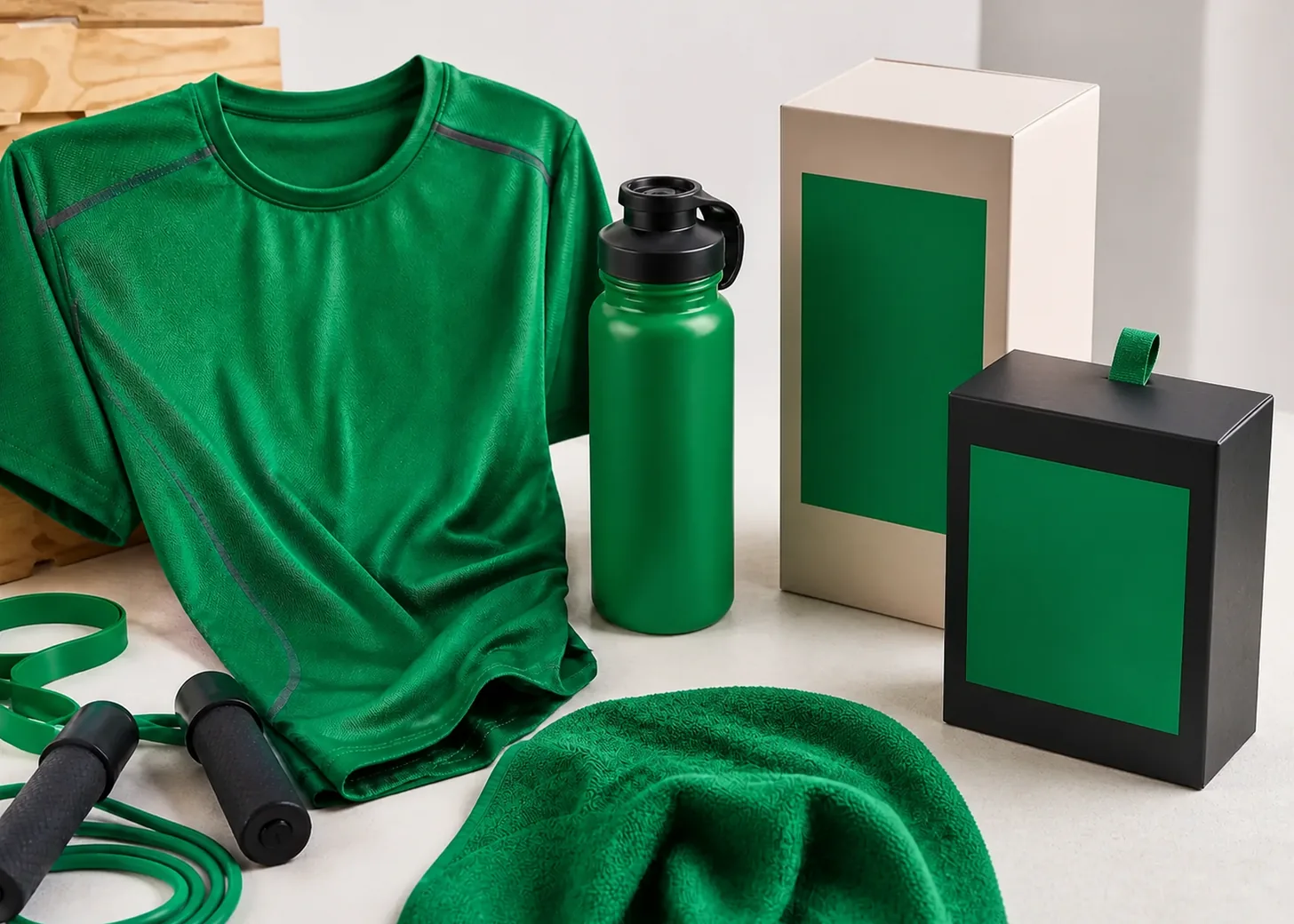
Place 347 C on a dominant textile panel, grip, or equipment surface, then use dark navy and pale neutral details to clarify construction. Repeating the green at controlled intervals can unify a family without making every object identical.
Consideration: Approve fabric, rubber, coating, and printed graphics separately from physical samples. This screen image cannot predict how different materials will express the same intended color direction.[1]
Food labeling
Use the green as a category band or framing panel around clear product information. Warm cream, tomato, and dark ink can prevent an automatic natural-food cliché while keeping the package energetic and easy to recognize.
Consideration: State ingredients, sourcing, and product benefits with accurate words and evidence. Do not rely on the green package color to imply health, environmental, or sustainability attributes.
Active interfaces
Reserve the approximate green for selected metrics, progress moments, or a primary action inside a mostly neutral interface. A cooler mint can extend the visual family for supporting panels without matching the active state.
Consideration: Combine status colors with text or icons and test every foreground value. Green alone should not carry success, availability, or completion meaning for the user.
Color palette ideas
Field Energy
Active Green
#009A44
Deep Navy
#152936
Chalk
#F1F0E8
Track Coral
#DF6048
Active Green: Lead the textile panel or most recognizable equipment surface.
Deep Navy: Define seams, hardware, type, and grounded supporting areas.
Chalk: Open space around marks and highlight construction details.
Track Coral: Add one warm performance accent in a limited position.
Navy and chalk give the green a clear athletic frame, while coral supplies a controlled opposing accent. The combination feels active without depending on environmental symbolism.
Market Label
Label Green
#009A44
Oat Paper
#E8D9B8
Tomato
#CE4D37
Brown Ink
#3A3028
Label Green: Create the category band and repeated identification point.
Oat Paper: Provide a warm information field with a tactile direction.
Tomato: Distinguish one variety, flavor, or opening detail.
Brown Ink: Carry primary wording and fine structural graphics.
The warmer companions move 347 C away from a generic eco signal. Green remains a category choice, while accurate copy must carry any substantive product message.
Measured Motion
Metric Green
#009A44
Interface Charcoal
#20282B
Cool Mint
#9ED8BF
Silver Mist
#D8DEDD
Metric Green: Mark the chosen metric, action, or progress highlight.
Interface Charcoal: Build the stable surrounding canvas and dark information layer.
Cool Mint: Support secondary charts and quiet selected backgrounds.
Silver Mist: Separate cards, dividers, and lower-priority contextual areas.
Charcoal makes the active green decisive, while mint creates a related but lower-intensity layer. Silver supplies separation without adding an unrelated status color.
Production guidance
- Use a current physical PANTONE 347 C guide or reference as the production target. The displayed HEX, RGB, and image remain approximate screen translations for exploration.[1]
- Create separate samples for textile, coated hardware, and printed label stock, then review the objects together. Define an acceptable family relationship rather than expecting unlike materials to appear identical.
- Audit every green application for implied meaning before approval. If the design could suggest a product, health, or sustainability claim, replace implication with precise, supportable copy or remove it.
- For digital use, test both black and white foreground candidates against the final implemented value. WCAG evaluation belongs to the complete text or component pairing, not the color name.[2]
Application example
Frequently asked questions
Does using PANTONE 347 C communicate sustainability?
Color may shape an impression, but it does not substantiate a sustainability claim. Use accurate, evidence-supported language for environmental information and avoid asking the green surface to carry that meaning by itself.
Should black or white text appear on the screen approximation?
Calculate both combinations using the final values and text category. This page supplies a catalog-based ratio, while WCAG 2.2 compliance depends on the actual foreground, background, size, and weight.
Will PANTONE 347 C match across fabric and packaging?
Do not assume an identical visual result. Use a current physical Pantone reference, produce samples on each intended material, and approve the relationship among those samples as part of the design system.
Sources
Publisher: Pantone.
Accessed August 6, 2026.
Web Content Accessibility Guidelines (WCAG) 2.2
Publisher: World Wide Web Consortium.
Published October 5, 2023. Accessed August 6, 2026.