Editorial color profile
Meaning, applications, and color guidance
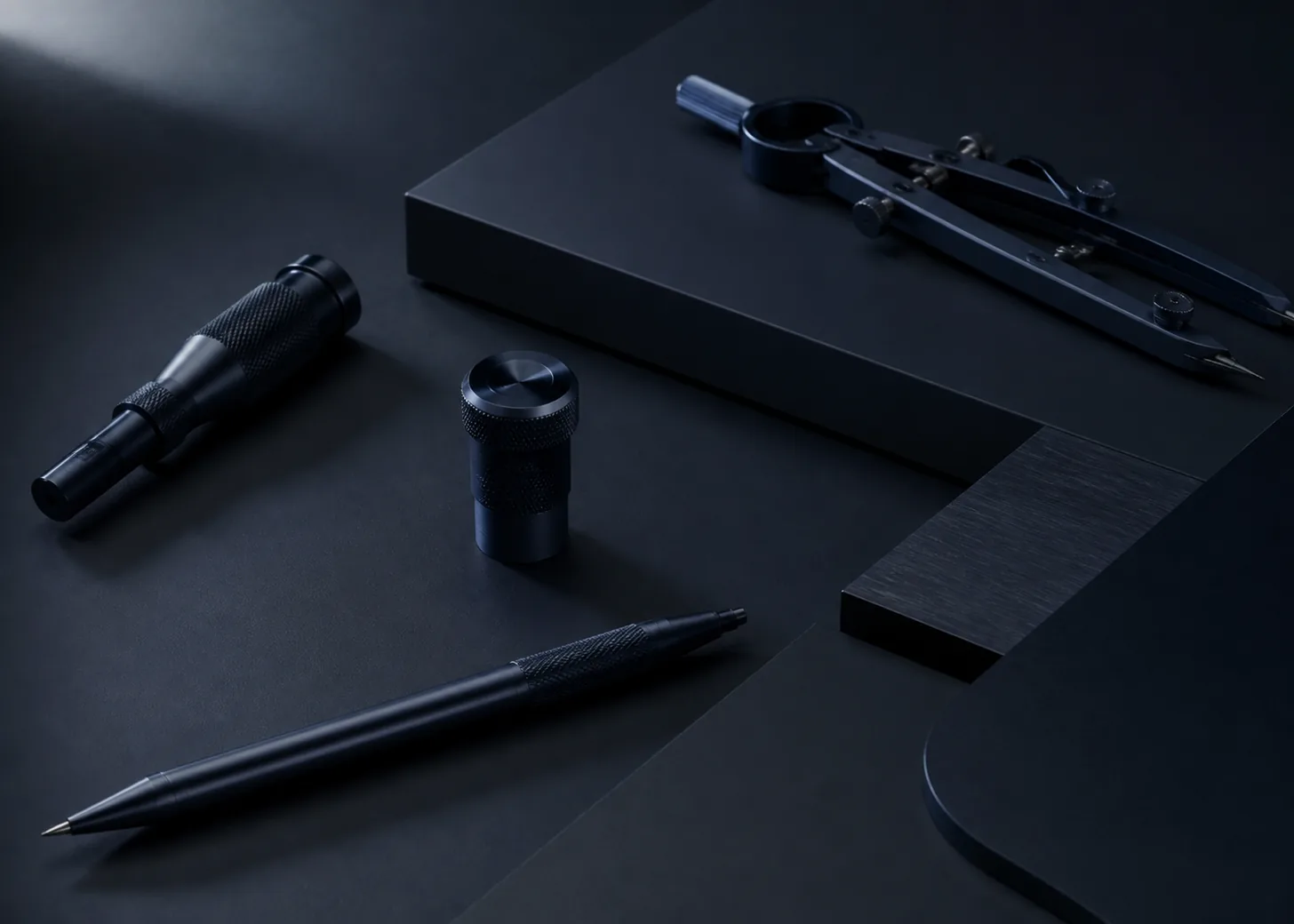
PANTONE 7547 C is treated here as a near-black navy: dark enough to establish authority, yet chromatic enough to feel less absolute than a neutral black. Side light and pale neighboring surfaces help the cool blue character become legible.
Technical stationery, a compact instrument, and metal fittings demonstrate how the color can organize an object family. Repeated dark details connect the objects while pale surfaces reveal the cool navy direction.
The HEX, RGB, and application image shown here are screen approximations. Use a current physical Pantone reference as the production target.[1]
Key color facts
- Pantone's Color Finder identifies the PANTONE 7547 C reference. Its physical reference, rather than this illuminated page, is the appropriate production target.[1]
- For the catalog HEX approximation: Calculated contrast with white: 16.86:1.
- WCAG 2.2 Success Criterion 1.4.3 sets minimum contrast of 4.5:1 for normal text and 3:1 for large text, measured from the actual foreground and background colors.[2]
- Using this navy instead of absolute black is an editorial option, not a universal rule. It works best when the small temperature difference supports the material story and remains visible beside lighter companions.
Calculated screen contrast
#131E29
- Relative luminance
- 0.012
- Black contrast
- 1.25:1
- White contrast
- 16.86:1
Recommended use cases
Technical stationery
Apply the near-black navy to notebook covers, folders, or binding details, then use cool white paper and a precise blue-gray grid. The result feels disciplined while retaining more chromatic depth than a plain black-and-white system.
Consideration: Keep small text on a separately tested light field when appropriate, and calculate any reversed digital type against the implemented value. Do not infer accessibility from the palette name alone.[2]
Instrument enclosure
Use 7547 C as the enclosure direction, with pale controls, restrained indicator colors, and a lighter surrounding surface. Side lighting in presentations can reveal the navy cast without requiring a decorative finish.
Consideration: Evaluate the actual enclosure sample and controls together. Treat the scene as art direction only and use the manufactured sample as the approval item.
Metal fittings
Concentrate the dark navy on clips, fasteners, frames, or narrow edge hardware beside warm gray and muted brass tones. Small repeated details can connect a collection without turning every broad surface dark.
Consideration: Approve metal components as physical samples beside paper and molded parts. Use the current physical Pantone reference to communicate the target, not the RGB appearance of this browser page.[1]
Color palette ideas
Technical Desk
Deep Navy
#131E29
Drafting White
#F2F4F3
Grid Blue
#7891A3
Signal Orange
#D96B37
Deep Navy: Build covers, cases, and the main dark structure.
Drafting White: Open paper fields and high-priority labels.
Grid Blue: Carry diagrams, dividers, and secondary controls.
Signal Orange: Mark one active or identifying detail.
White exposes the navy undertone, grid blue extends its cool range, and a small orange note prevents the technical system from becoming visually inert.
Precision Hardware
Instrument Navy
#131E29
Machined Gray
#878F95
Pale Alloy
#CCD1D3
Muted Brass
#9C8050
Instrument Navy: Define the principal enclosure and repeated fittings.
Machined Gray: Separate moving or adjustable parts.
Pale Alloy: Create light edges and surrounding surfaces.
Muted Brass: Add a warm material counterpoint in one fitting.
Two gray levels help reveal dark shapes and controls. Muted brass introduces temperature contrast while remaining restrained enough for a technical product family.
Night Archive
Archive Navy
#131E29
Slate
#465563
Warm Paper
#DED5C5
Oxide Red
#8A3E38
Archive Navy: Carry boxes, spines, or full divider panels.
Slate: Provide a readable middle step between dark and light.
Warm Paper: Hold long reading areas and physical inserts.
Oxide Red: Identify one series or priority category.
Slate makes the near-black base easier to read as navy, and warm paper softens the contrast. Oxide red supplies a serious, low-saturation identifier.
Production guidance
- Use a current physical PANTONE 7547 C guide or reference as the production target. HEX, RGB, and the application image are digital or conceptual approximations.[1]
- Review the proposed dark surface beside its actual pale labels, paper, and hardware. The navy character may be too subtle for a presentation composed only of dark isolated chips.
- Create separate physical samples for stationery, instrument components, and metal fittings, then assemble them into one review group. Define which elements should match and which should simply coordinate.
- For any digital reversed type, calculate the exact contrast and evaluate every state under WCAG 2.2. The profile ratio does not validate photographs, overlays, or modified background values.[2]
Application example
Frequently asked questions
Can PANTONE 7547 C replace black?
It can be an editorial alternative when a near-black navy supports the desired mood, but it is not a universal replacement. Compare both directions at realistic size and beside the intended light materials.
Is white text suitable on the 7547 C screen approximation?
The calculated contrast offers a strong starting measurement. Still test the exact implemented background, text size, weight, and interactive states under WCAG 2.2 before making a conformance decision.
How should the physical color be approved?
Use a current physical PANTONE 7547 C reference, then review samples of the actual paper, enclosure, and fittings together. Treat this page's HEX, RGB, and concept image only as screen approximations.
Sources
Publisher: Pantone.
Accessed August 6, 2026.
Web Content Accessibility Guidelines (WCAG) 2.2
Publisher: World Wide Web Consortium.
Published October 5, 2023. Accessed August 6, 2026.