Editorial color profile
Meaning, applications, and color guidance
Pantone identifies the official designation as Black 0961 C. The HEX, RGB, and application image on this page are screen approximations and do not replace the physical Pantone reference.[1]
Visually, the warm medium-gray impression creates a useful naming paradox. That tension makes the color more interesting than a conventional neutral and invites material-led applications rather than literal expectations.
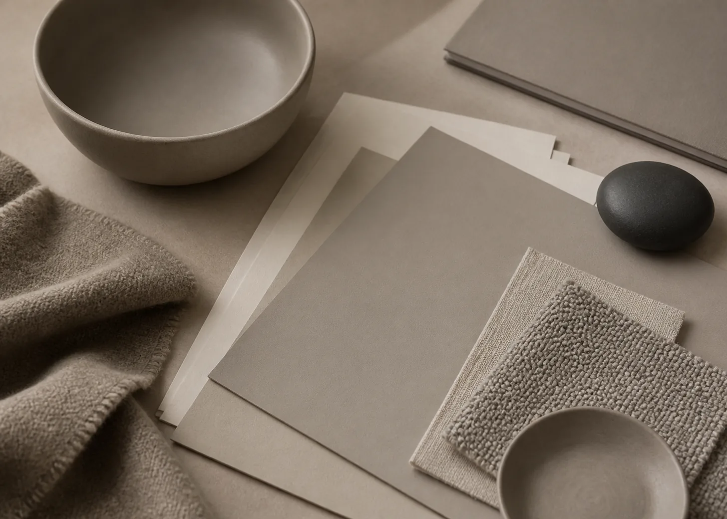
This profile explores ceramic surfaces, design paper, and woven fabric, where quiet differences in texture can carry the composition. The creative direction relies on scale, neighboring values, and a restrained material palette.
Key color facts
- Pantone's Color Finder identifies the Black 0961 C reference. The name belongs to the official color designation and should not be treated as a promise that every digital rendering will look nearly black.[1]
- For this catalog record: Catalog CMYK value: unavailable.
- WCAG 2.2 sets contrast thresholds of 4.5:1 for normal text and 3:1 for large text under Success Criterion 1.4.3; test the actual foreground and background values used in the interface.[2]
- Treat the warm gray impression as a starting point for art direction, not as a substitute name. Keep naming context visible in team notes so creative language and purchasing identifiers do not become interchangeable.
Calculated screen contrast
#9E978E
- Relative luminance
- 0.314
- Black contrast
- 7.27:1
- White contrast
- 2.89:1
Recommended use cases
Ceramic objects
Use the neutral across a vase, tile, or tableware family, then vary silhouette and surface character instead of adding many colors. Cream, clay, and dark brown accents can frame its warmth while preserving a calm studio atmosphere.
Consideration: Judge the selected ceramic finish from a physical sample beside the other materials. The concept image cannot predict a manufactured surface, and the digital chip is only an approximate planning reference.[1]
Design paper systems
Build a stationery or editorial set around broad neutral fields, generous margins, and compact dark typography. One rust or olive detail can provide orientation without breaking the deliberately restrained hierarchy.
Consideration: Compare the proposed physical stock and printed sample together. Avoid copying this page's RGB or HEX value into a print specification and expecting it to define the physical result.[1]
Layered textiles
Place the warm neutral across woven fabric, felt, or a soft accessory, then separate layers through weave scale and edge construction. Charcoal hardware gives definition; pale linen keeps the composition open.
Consideration: View full-size material samples in the setting where they will be approved. Keep the chosen color target documented separately from this textural art direction.
Color palette ideas
Quiet Workshop
Warm Gray
#9E978E
Porcelain
#E8E1D7
Walnut
#43352D
Clay
#A66146
Warm Gray: Set the main ceramic or paper field.
Porcelain: Open highlights and surrounding negative space.
Walnut: Anchor bases, type, or narrow structural edges.
Clay: Add one earthy point of focus.
The palette keeps every companion material-minded. Porcelain clarifies the gray, walnut supplies depth, and clay makes its underlying warmth easier to notice without forcing a colorful composition.
Editorial Neutral
Paper Gray
#9E978E
Ink
#242321
Linen
#D2C7B5
Moss
#66705A
Paper Gray: Carry covers, dividers, or wide information panels.
Ink: Provide the firmest typographic structure.
Linen: Separate content with a lighter tactile neutral.
Moss: Mark categories with a muted chromatic accent.
Ink prevents the middle values from becoming vague, while linen adds an understated layer. Moss supplies a controlled signal that suits quiet editorial or stationery applications.
Soft Utility
Utility Gray
#9E978E
Graphite
#34383B
Oat
#C9B995
Dusty Blue
#657883
Utility Gray: Unify fabric panels and coated objects.
Graphite: Define closures, hardware, and labels.
Oat: Warm natural fibers and supporting surfaces.
Dusty Blue: Introduce a cool counterweight in one layer.
Graphite gives the featured gray a stronger boundary. Oat continues its warmth, while dusty blue creates enough temperature contrast to distinguish adjacent textiles and small components.
Production guidance
- Specify Black 0961 C from a current physical Pantone guide or reference. HEX, RGB, and this page's application image are screen approximations for exploration, not production standards.[1]
- Before planning a process-color build, check this site's catalog record: Catalog CMYK value: unavailable.
- If a required conversion is unavailable, keep that gap explicit rather than inserting an invented generic breakdown. Establish and approve any process-color build within the real production workflow.
- Collect ceramic, paper, textile, and hardware samples in one approval group. Decide whether they should form a coordinated family, because demanding an identical appearance from unlike objects is rarely the most useful creative brief.
- For digital layouts, calculate contrast from the implemented values and test normal text at 4.5:1 and large text at 3:1 or better under WCAG 2.2.[2]
Application example
Frequently asked questions
Why does PANTONE Black 0961 C look gray here?
Black 0961 C is the official designation, while this site's HEX and RGB rendering is an approximate screen translation that appears as a warm medium gray. Use the name for identification and a current physical Pantone reference for production judgment.
Does the catalog provide a CMYK value for Black 0961 C?
This site's catalog record is checked directly rather than filled with a generic conversion. If a process build is required, create and approve it for the intended production conditions. Catalog CMYK value: unavailable.
Which materials suit this warm neutral direction?
Ceramic, unprinted or designed paper, woven fabric, and restrained metal details make a useful editorial starting set. Sample the actual materials together and let their texture provide variation before introducing more accent colors.
Sources
PANTONE Black 0961 C Color Finder
Publisher: Pantone.
Accessed August 6, 2026.
Web Content Accessibility Guidelines (WCAG) 2.2
Publisher: World Wide Web Consortium.
Published October 5, 2023. Accessed August 6, 2026.