Editorial color profile
Meaning, applications, and color guidance
Illuminating is a yellow that benefits from a clear boundary and a defined amount of space. A small yellow tab can guide attention; a broad yellow cover can establish an identity. Both need a dark anchor and enough neutral area to organize the remaining information.
This profile explores publication covers, product accents, and a gray-and-yellow exhibition system. The aim is a useful hierarchy rather than brightness everywhere. Decide which element deserves the yellow before applying it to buttons, labels, borders, and backgrounds at once.
The HEX, RGB, and illustration on this page are screen approximations. Use a current physical Pantone reference to select and approve the material-specific production target.[2]
Key color facts
- Pantone selected PANTONE 13-0647 Illuminating together with Ultimate Gray as its Color of the Year for 2021. This provides a documented historical context for the reference.[1]
- The TCX reference identifies Illuminating within the Fashion, Home + Interiors Cotton library. It is distinct from a Solid Coated or Uncoated ink reference; keep the system and suffix when specifying the color.[2]
- WCAG 2.2 sets a minimum contrast of 4.5:1 for normal text and 3:1 for large text under Success Criterion 1.4.3. Evaluate the actual digital foreground and background together.[3]
- For this catalog HEX approximation: Calculated contrast with black: 15.54:1.
Calculated screen contrast
#F5DF4D
- Relative luminance
- 0.727
- Black contrast
- 15.54:1
- White contrast
- 1.35:1
Recommended use cases
Publication covers
Let yellow occupy one strong cover shape, with black typography and off-white supporting areas. Repeat a small yellow spine marker across a series while allowing photographs and issue titles to change, creating recognition through placement as well as hue.
Consideration: Test thumbnail and full-size layouts; fine white details can disappear where bold black shapes remain easy to distinguish.
Product accents
Use yellow for a handle, zipper pull, or small insert against deep blue and gray. Repeating that detail across several objects can create a recognizable product family without making every surface compete for the same level of attention.
Consideration: Check the assembled item in its intended surroundings, including wear, cleaning, and changes in the neighboring material finish.
Exhibition markers
Place yellow markers within a gray framework and let charcoal identifiers carry the detailed information. Keep a consistent marker shape across maps, doors, and labels so the visual system still has structure when visitors encounter only one part of it.
Consideration: Treat the scheme as a design proposal; validate the complete installation against the actual viewing distances and relevant project requirements.
Color palette ideas
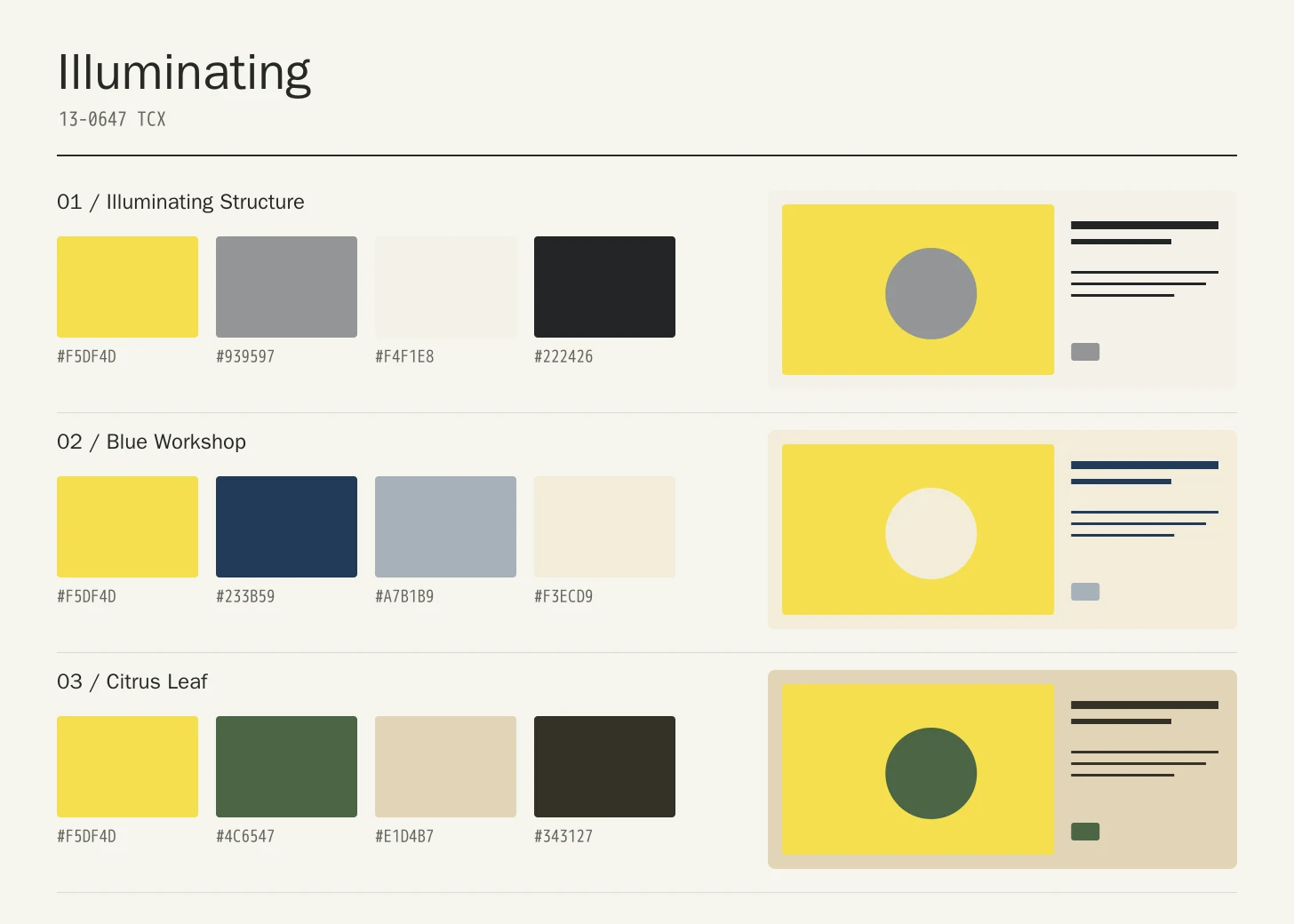
Illuminating Structure
Illuminating
#F5DF4D
Ultimate Gray
#939597
Off White
#F4F1E8
Graphic Black
#222426
Illuminating: Give Illuminating the main field or identifying shape.
Ultimate Gray: Build a supporting frame around the yellow markers.
Off White: Give longer information a quiet light surface.
Graphic Black: Carry detailed labels and compact graphic shapes.
Gray supplies the repeated framework, Off White gives detailed information room, and Graphic Black establishes decisive anchors. The yellow should identify selected points of attention rather than becoming an extra border around every object in the system.
Blue Workshop
Illuminating
#F5DF4D
Deep Blue
#233B59
Steel
#A7B1B9
Paper
#F3ECD9
Illuminating: Use Illuminating on the featured object or motif.
Deep Blue: Create a quieter neighbor around the principal colored surface.
Steel: Give this companion a distinct, limited supporting assignment.
Paper: Ground the family through consistent placement of smaller details.
Deep Blue gives the yellow a cool and substantial partner, while Steel connects supporting surfaces. Paper prevents the scheme from feeling overly industrial. A narrow yellow detail can be enough to connect several differently sized pieces.
Citrus Leaf
Illuminating
#F5DF4D
Leaf
#4C6547
Pale Sand
#E1D4B7
Warm Ink
#343127
Illuminating: Repeat Illuminating at a consistent point across layouts.
Leaf: Leave room around imagery without adding competing emphasis.
Pale Sand: Adjust this supporting area beside the featured color.
Warm Ink: Distinguish fine information through value, placement, and foreground contrast.
Leaf creates a restrained green counterpoint, Pale Sand softens the surrounding area, and Warm Ink handles fine information. The yellow remains the brightest event in the composition, so its repetition should follow a clear placement rule.
Production guidance
- Specify the full PANTONE 13-0647 TCX textile reference. Use a current physical Pantone sample; a screen preview cannot approve an ink or another material.[2]
- For a product family, approve the yellow component in its assembled setting rather than from an isolated chip. Record the intended texture and finishing process, and compare the piece with both the gray and deep blue alternatives before final selection.
- These companion colors are original editorial suggestions. Agree on proportions, surfaces, and acceptance samples before ordering a coordinated collection.
Application example
Frequently asked questions
Is the Illuminating HEX value a production specification?
No. HEX and RGB are approximate screen representations. Specify the full reference and system, then approve a current physical Pantone sample alongside the intended material.
Should Illuminating always be paired with Ultimate Gray?
Pantone selected the two shades together for 2021, but that history does not require every new project to use both. The palettes here are editorial proposals; choose companions and proportions that serve the actual object, information, and viewing context.
How should I check text on Illuminating?
Check the exact background, foreground, and text size under WCAG 2.2. The displayed black ratio is a starting point; transparency, images, and interactive states need separate assessment.
Sources
Pantone Color of the Year 2021: Illuminating
Publisher: Pantone.
Accessed October 13, 2026.
PANTONE 13-0647 TCX Illuminating Color Finder
Publisher: Pantone.
Accessed October 13, 2026.
Web Content Accessibility Guidelines (WCAG) 2.2
Publisher: World Wide Web Consortium.
Published October 5, 2023. Accessed October 13, 2026.