Color Inspiration
10 Pantone Colors of the Year: Palette Ideas Beyond the Trend
Revisit ten Pantone Colors of the Year from 2017–2025 with original palette ideas, practical design roles, and links to each TCX color reference.
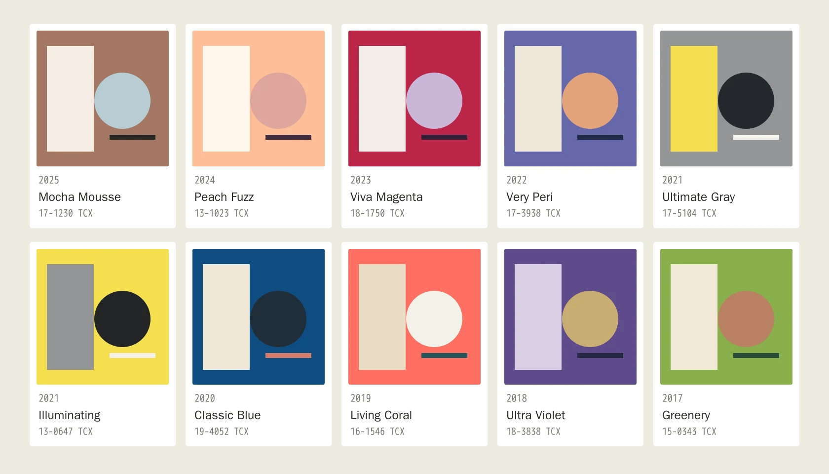
Pantone Colors of the Year make an annual announcement feel like a starting gun. A shade appears on mood boards, product concepts, and campaign proposals, then the calendar moves on. For a designer, the more useful question comes later: what can that color do when it no longer needs to represent a particular year?
This guide revisits ten shades selected between 2017 and 2025. That is nine years and ten colors because Pantone chose Ultimate Gray and Illuminating together for 2021. Each reference offers a different compositional possibility, from a brown that can anchor a tactile identity to a yellow that can connect a system through one repeated detail.
Ten Pantone Colors of the Year at a Glance
| Year | Color reference | Approximate HEX | Suggested role |
|---|---|---|---|
| 2025 | 17-1230 TCX Mocha Mousse | #A47864 | A warm base for tactile identities |
| 2024 | 13-1023 TCX Peach Fuzz | #FFBE98 | A soft field with a decisive dark partner |
| 2023 | 18-1750 TCX Viva Magenta | #BB2649 | One expressive shape or repeated accent |
| 2022 | 17-3938 TCX Very Peri | #6667AB | A blue-violet bridge between warm and cool |
| 2021 | 17-5104 TCX Ultimate Gray | #939597 | A framework around lighter and darker areas |
| 2021 | 13-0647 TCX Illuminating | #F5DF4D | A concentrated marker of attention |
| 2020 | 19-4052 TCX Classic Blue | #0F4C81 | A substantial anchor for an open layout |
| 2019 | 16-1546 TCX Living Coral | #FF6F61 | A warm detail beside a cooler anchor |
| 2018 | 18-3838 TCX Ultra Violet | #5F4B8B | An expressive field with lighter intervals |
| 2017 | 15-0343 TCX Greenery | #88B04B | An energetic focal point in a quiet setting |
Warm Neutrals and Soft Fields: Mocha Mousse and Peach Fuzz
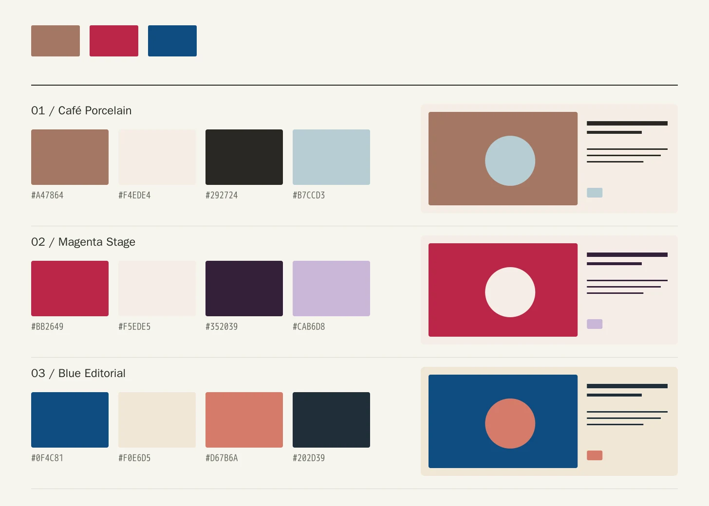
Mocha Mousse was Pantone's 2025 selection. For a café identity, try its brown with Porcelain #F4EDE4, Ink #292724, and Mist Blue #B7CCD3. The brown can own a cover or sign, porcelain can hold the menu, and blue can identify one small recurring detail. This changes the question from ‘does brown feel current?’ to ‘does every element have a clear job?’ Check the identity with ordinary content and photographs, not only a carefully arranged presentation.
Peach Fuzz was Pantone's 2024 selection. Try it with Warm White #FFF6EC, Aubergine #402B3A, and Soft Rose #DDA69D for a skincare carton or welcoming editorial page. Aubergine gives detailed information a darker home; soft rose can create a supporting layer. Keep peach and rose unequal in area so their similarity does not blur the hierarchy. Softness becomes more convincing when the composition also contains a clear edge, an intentional margin, and readable type.
Expressive Color: Viva Magenta and Very Peri
Viva Magenta was selected for 2023. A cultural poster could pair it with Soft Ivory #F5EDE5, Deep Plum #352039, and Pale Lilac #CAB6D8. Let magenta lead the principal shape, use ivory for breathing room, and give practical details a consistent dark anchor. Carry that shape into a ticket or small social graphic. If the identity only works when magenta fills the entire screen, it may need stronger typography and geometry before it needs another accent color.
Very Peri was Pantone's newly created 2022 selection, introduced as a periwinkle blue with a violet-red undertone. Try Warm Paper #EEE7DA, Navy Ink #242D4B, and Apricot #E2A279 around it for a creative studio identity. Warm paper offsets the cool field while navy holds the information together. Apricot should have a small, repeatable assignment, such as issue numbers or labels. Compare the arrangement with and without photography; an interesting swatch relationship still needs to accommodate the project's actual images.
Two Colors, One Year: Ultimate Gray and Illuminating
Pantone selected Ultimate Gray and Illuminating together for 2021. They remain separate references, and their shared history does not dictate equal proportions. For an exhibition framework, try the gray with Illuminating #F5DF4D, Chalk #F5F2E9, and Charcoal #25292C. Gray can organize the repeated panels; chalk can make room for labels; yellow can identify a few destinations. Give each marker a consistent shape so navigation has more than color to carry it.
A yellow-led composition needs a different balance. For a notebook or small product family, try Illuminating with Deep Blue #233B59, Steel #A7B1B9, and Paper #F3ECD9. A yellow spine, zipper pull, or handle may connect the range more effectively than an entirely yellow object. Check the idea at its real size. A tiny accent that disappears in use needs a placement or scale adjustment, not necessarily a brighter replacement.
Blue and Coral: Two Ways to Set the Temperature
Classic Blue was the 2020 selection. Combine it with Warm Paper #F0E6D5, Coral Accent #D67B6A, and Dark Ink #202D39 for a publication identity. Blue can anchor covers and chapter openings while warm paper supports extended reading. The coral detail introduces a different temperature without becoming a second identity. Keep the palette through an index, a dense spread, and an image-led opener; those three layouts reveal more than a single polished cover.
Living Coral was selected for 2019. Reverse the emphasis with Pale Sand #E9DCC5, Deep Teal #24565B, and Foam #F2F1E9 around the coral. This can suit event graphics or a small home-accessory group. Let coral supply the recognizable warm shape and teal hold the strongest anchors. In a room, repeat the coral at two different scales rather than matching every cushion, vessel, and textile. The repetition should connect the arrangement while leaving other materials visible.
Violet and Green: Give the Focal Point Some Space
Ultra Violet was Pantone's 2018 selection. Try Pale Lilac #D9D0E5, Night Navy #24263F, and Muted Gold #C9AD73 for a performance identity. Violet can lead the expressive field; navy can anchor the smaller details; gold can identify one restrained feature. Avoid giving every supporting color the same area. A pale interval around the violet often does more for the composition than another decorative purple, especially when a poster must accommodate changing names and dates.
Greenery was selected for 2017. Pair it with Warm Paper #F0E8D6, Forest #294B36, and Clay #B98061 for a garden event or home-object collection. Forest gives the energetic green a deeper neighbor, while clay introduces warmth without adding another bright signal. Check the arrangement beside actual plants and wood. Green can support a visual theme, but it cannot establish environmental performance, sourcing, or certification; those claims need their own evidence.
Turn a Palette into a Usable Brief
Start with a role, not a year. Choose a featured hue, a light field, a dark anchor, and an optional supporting accent. Open the Pantone Color Finder to explore references, or use Pantone to HEX for an approximate screen value. TCX identifies a cotton reference in Fashion, Home + Interiors; it does not specify a Solid Coated ink. For a print project, shortlist the appropriate ink reference and approve the actual substrate and finish with your production partner.
- Test a dense information layout, an image-led layout, and the smallest real application before approving the palette.
- Check exact digital foregrounds and backgrounds under WCAG 2.2: normal text needs at least 4.5:1 contrast and large text 3:1 under Success Criterion 1.4.3.
- Use labels or shapes alongside color when communicating a category, state, or destination.
- Record the full reference, color system, substrate, finish, and approved sample for each production method.
Avoid treating equal swatches as a finished design, copying an approximate HEX into an unrelated production process, or choosing pale text because the palette feels soft. If you want to connect this retrospective to a newer neutral, read our Cloud Dancer 2026 guide. Compare it as another working color, with its own material and contrast decisions, rather than replacing every earlier shade because the year changed.
FAQ
Why are there ten colors across nine years?
Pantone selected Ultimate Gray and Illuminating together for 2021. The other years in this 2017–2025 selection contribute one color each, giving ten individual references in total.
Are these official Pantone palettes?
No. Pantone is the source for the color identities and selection years. The combinations, proportions, and application suggestions are original ColorToco editorial proposals.
Can I send the listed HEX values straight to a manufacturer?
Use them for screen planning only. Share the full reference and system, then agree on an appropriate physical standard, material-specific specification, and approved sample with the manufacturer.
Sources
- The Story of Pantone Color of the Year 2025Pantone
- Pantone Color of the Year 2024: Peach FuzzPantone
- What Is Viva Magenta?Pantone
- Introducing Very Peri: Pantone Color of the Year 2022Pantone
- Pantone Color of the Year 2021: Ultimate Gray and IlluminatingPantone
- Pantone Color of the Year 2020: Classic BluePantone
- Pantone Color of the Year 2019: Living CoralPantone
- Pantone Color of the Year 2018: Ultra VioletPantone
- Pantone Outside In: Bringing the Color of the Year 2017 to LifePantone
- Pantone TCX Color Finder: Very PeriPantone
- WCAG 2.2: Contrast (Minimum)World Wide Web Consortium