Editorial color profile
Meaning, applications, and color guidance
Viva Magenta is most persuasive when it has a defined job. A broad colored field can lead a cultural poster, while the same hue may work better as a small identifying detail in a product interface. Set its area and repetition before adding more accents.
This profile treats the red as an expressive anchor for event identities, product families, and editorial graphics. A quiet surrounding palette can leave room for that expression, while a deep foreground prevents the information hierarchy from depending on saturation alone.
The HEX, RGB, and illustration on this page are screen approximations. Use a current physical Pantone reference to select and approve the material-specific production target.[2]
Key color facts
- Pantone selected PANTONE 18-1750 Viva Magenta as its Color of the Year for 2023. This provides a documented historical context for the reference.[1]
- The TCX reference identifies Viva Magenta within the Fashion, Home + Interiors Cotton library. It is distinct from a Solid Coated or Uncoated ink reference; keep the system and suffix when specifying the color.[2]
- WCAG 2.2 sets a minimum contrast of 4.5:1 for normal text and 3:1 for large text under Success Criterion 1.4.3. Evaluate the actual digital foreground and background together.[3]
- For this catalog HEX approximation: Calculated contrast with black: 3.49:1.
Calculated screen contrast
#BB2649
- Relative luminance
- 0.124
- Black contrast
- 3.49:1
- White contrast
- 6.02:1
Recommended use cases
Cultural event identity
Let magenta carry the main poster field, with pale type areas and a compact dark plum anchor. Across tickets and social graphics, repeat one recognizable magenta shape so the event identity survives changes in photography and layout.
Consideration: Check the smallest event details independently; a bold headline treatment is not a reliable test of fine information.
Beauty product family
Give one product a magenta cap or side panel and place it against soft stone and darker berry companions. Use the same placement rule across sizes to establish recognition without making every carton equally loud or crowded.
Consideration: Distinguish variants through labels and layout as well as color, especially when several similar red tones appear together.
Editorial data accents
Reserve magenta for a selected series, key annotation, or section marker while cool gray and near-black hold the surrounding information. Repetition can connect charts to explanatory text without requiring every graphic element to compete for attention.
Consideration: Use labels or shapes alongside color coding, and test contrast against the exact chart background and text sizes.[3]
Color palette ideas
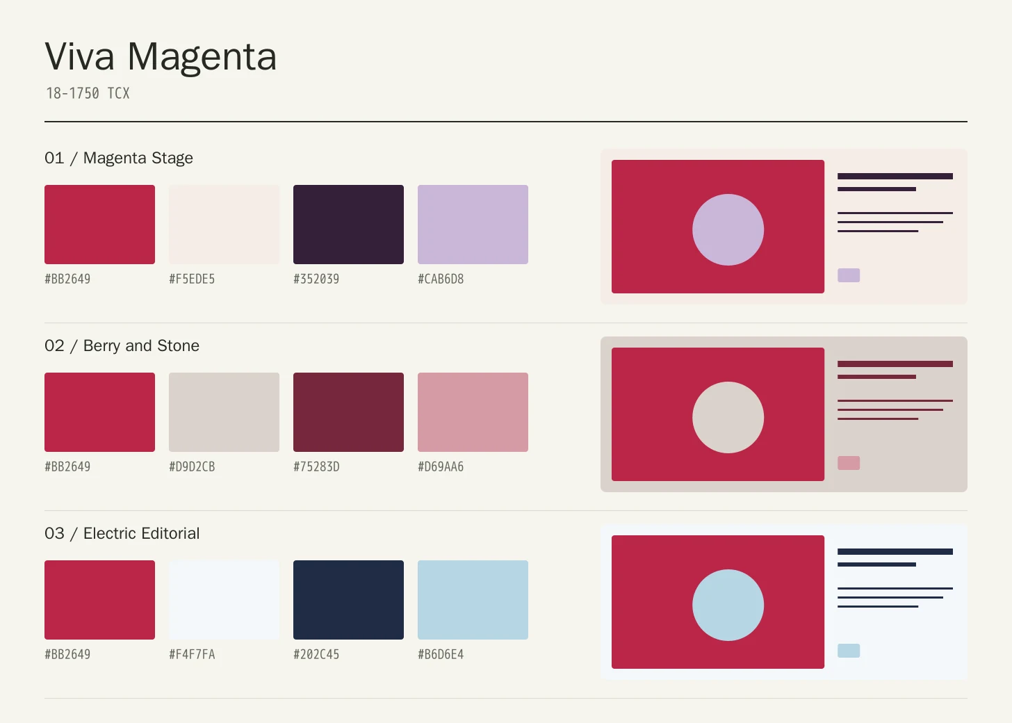
Magenta Stage
Viva Magenta
#BB2649
Soft Ivory
#F5EDE5
Deep Plum
#352039
Pale Lilac
#CAB6D8
Viva Magenta: Give Viva Magenta the main field or identifying shape.
Soft Ivory: Leave lighter intervals around longer information and open margins.
Deep Plum: Anchor the strongest labels, outlines, or structural details here.
Pale Lilac: Repeat this accent sparingly to connect differently sized elements.
Ivory provides a quiet reading surface, Deep Plum establishes hierarchy, and Pale Lilac supports secondary areas. The magenta can lead the largest expressive shape while the other colors keep the composition from becoming a wall of competing accents.
Berry and Stone
Viva Magenta
#BB2649
Stone
#D9D2CB
Berry
#75283D
Muted Pink
#D69AA6
Viva Magenta: Use Viva Magenta on the featured object or motif.
Stone: Create a quieter neighbor around the principal colored surface.
Berry: Give this companion a distinct, limited supporting assignment.
Muted Pink: Ground the family through consistent placement of smaller details.
Stone lowers the visual pressure around the red, while Berry supplies depth within a related family. Muted Pink works as a supporting layer rather than an equal signal, making this a useful direction for a coordinated range of objects.
Electric Editorial
Viva Magenta
#BB2649
Cool White
#F4F7FA
Midnight
#202C45
Ice Blue
#B6D6E4
Viva Magenta: Repeat Viva Magenta at a consistent point across layouts.
Cool White: Leave room around imagery without adding competing emphasis.
Midnight: Adjust this supporting area beside the featured color.
Ice Blue: Distinguish fine information through value, placement, and foreground contrast.
The cool companions make magenta feel precise and graphic. Midnight gives dense information a stable home, Ice Blue distinguishes secondary panels, and Cool White prevents the red from having to carry both emphasis and the whole background.
Production guidance
- Specify the full PANTONE 18-1750 TCX textile reference. Use a current physical Pantone sample; a screen preview cannot approve an ink or another material.[2]
- For an event identity, check the large poster, ticket, fabric banner, and screen graphic as a family. Decide which feature must remain recognizable across them, then approve each production method with a relevant sample and documented reference.
- These companion colors are original editorial suggestions. Agree on proportions, surfaces, and acceptance samples before ordering a coordinated collection.
Application example
Frequently asked questions
Is the Viva Magenta HEX value a production specification?
No. HEX and RGB are approximate screen representations. Specify the full reference and system, then approve a current physical Pantone sample alongside the intended material.
How much Viva Magenta should a palette use?
Start with one clearly defined role: a main expressive field or a repeated accent. Increase the area only when the information hierarchy still works. There is no universal percentage; the size of type, neighboring imagery, and viewing distance all affect the balance.
How should I check text on Viva Magenta?
Check the exact background, foreground, and text size under WCAG 2.2. The displayed black ratio is a starting point; transparency, images, and interactive states need separate assessment.
Sources
Pantone Color of the Year 2023: Viva Magenta
Publisher: Pantone.
Accessed October 13, 2026.
PANTONE 18-1750 TCX Viva Magenta Color Finder
Publisher: Pantone.
Accessed October 13, 2026.
Web Content Accessibility Guidelines (WCAG) 2.2
Publisher: World Wide Web Consortium.
Published October 5, 2023. Accessed October 13, 2026.