Editorial color profile
Meaning, applications, and color guidance
Peach Fuzz can bring warmth to a composition without taking on the force of a bright orange. Its most useful partner is often a decisive dark: that anchor lets the peach occupy generous areas while labels, edges, and important controls retain a clear hierarchy.
The directions below explore skincare packaging, textile layering, and friendly editorial pages. Treat softness as a compositional choice rather than a reason to lower contrast everywhere. Pale supporting colors need differences in scale and placement to remain distinct.
The HEX, RGB, and illustration on this page are screen approximations. Use a current physical Pantone reference to select and approve the material-specific production target.[2]
Key color facts
- Pantone selected PANTONE 13-1023 Peach Fuzz as its Color of the Year for 2024. This provides a documented historical context for the reference.[1]
- The TCX reference identifies Peach Fuzz within the Fashion, Home + Interiors Cotton library. It is distinct from a Solid Coated or Uncoated ink reference; keep the system and suffix when specifying the color.[2]
- WCAG 2.2 sets a minimum contrast of 4.5:1 for normal text and 3:1 for large text under Success Criterion 1.4.3. Evaluate the actual digital foreground and background together.[3]
- For this catalog HEX approximation: Calculated contrast with black: 13.07:1.
Calculated screen contrast
#FFBE98
- Relative luminance
- 0.604
- Black contrast
- 13.07:1
- White contrast
- 1.61:1
Recommended use cases
Skincare packaging
Use peach on one broad carton panel with a dark aubergine information block and warm white margins. Repeated peach lids or labels can connect a range, while typography and spacing make the individual products easy to tell apart.
Consideration: Do not use the shade or its gentle appearance as evidence of product ingredients, skin suitability, or performance.
Textile layering
Place peach beside oatmeal, muted terracotta, and a small deep green accent. Use changes in weave and surface texture to separate neighboring warm tones, keeping one broad quiet field so the composition does not become visually crowded.
Consideration: View a complete ensemble rather than individual swatches; neighboring skin tones, lining, and accessories can change the relationship.
Friendly editorial pages
Try peach section backgrounds around short introductions, with dark text and warm white reading areas. A cooler green detail can distinguish small navigation elements from decorative highlights when the same layout carries several types of content.
Consideration: Validate the exact text pairings and focus states under WCAG 2.2, including controls that cross between peach and white surfaces.[3]
Color palette ideas
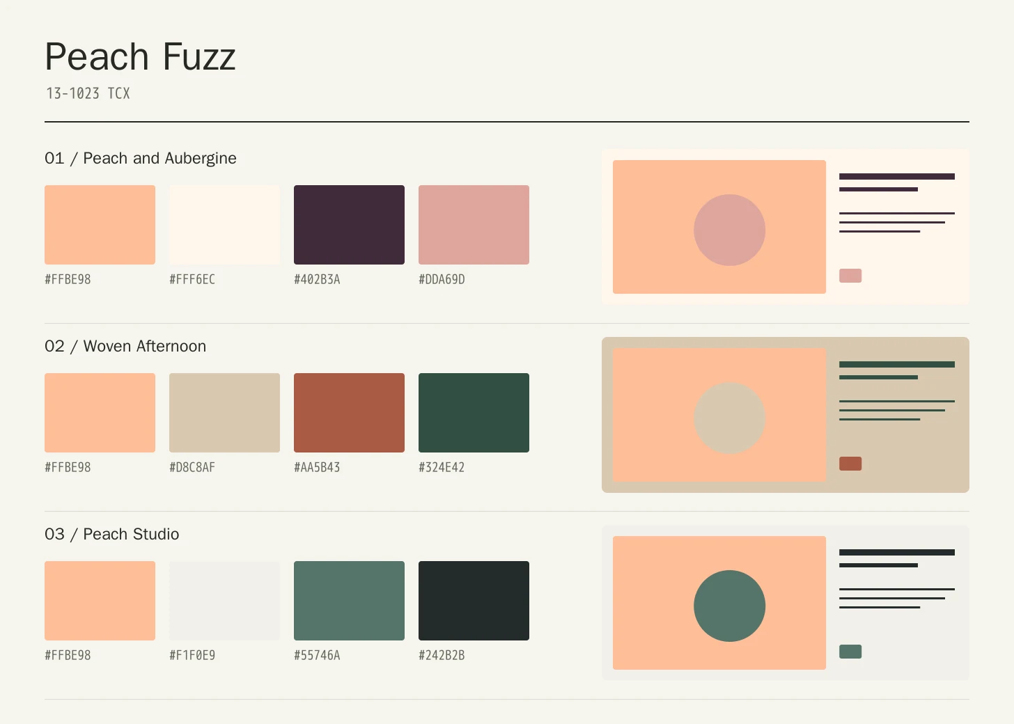
Peach and Aubergine
Peach Fuzz
#FFBE98
Warm White
#FFF6EC
Aubergine
#402B3A
Soft Rose
#DDA69D
Peach Fuzz: Give Peach Fuzz the main field or identifying shape.
Warm White: Leave lighter intervals around longer information and open margins.
Aubergine: Anchor the strongest labels, outlines, or structural details here.
Soft Rose: Repeat this accent sparingly to connect differently sized elements.
Aubergine gives the pale peach a strong structural partner, while Warm White supplies room for information. Soft Rose is best kept to secondary surfaces, where it can add depth without weakening the difference between content and decoration.
Woven Afternoon
Peach Fuzz
#FFBE98
Oatmeal
#D8C8AF
Terracotta
#AA5B43
Deep Leaf
#324E42
Peach Fuzz: Use Peach Fuzz on the featured object or motif.
Oatmeal: Create a quieter neighbor around the principal colored surface.
Terracotta: Give this companion a distinct, limited supporting assignment.
Deep Leaf: Ground the family through consistent placement of smaller details.
Oatmeal extends the warm field, Terracotta gives it a richer edge, and Deep Leaf supplies a cool anchor. The arrangement suits layered objects where seams, folds, and surface texture can separate related warm areas.
Peach Studio
Peach Fuzz
#FFBE98
Chalk
#F1F0E9
Slate Green
#55746A
Soft Ink
#242B2B
Peach Fuzz: Repeat Peach Fuzz at a consistent point across layouts.
Chalk: Leave room around imagery without adding competing emphasis.
Slate Green: Adjust this supporting area beside the featured color.
Soft Ink: Distinguish fine information through value, placement, and foreground contrast.
Chalk creates an open canvas around the peach, and Slate Green introduces a measured temperature change. Soft Ink carries dense information. Let the peach announce a section rather than filling every available space with another pale tone.
Production guidance
- Specify the full PANTONE 13-1023 TCX textile reference. Use a current physical Pantone sample; a screen preview cannot approve an ink or another material.[2]
- For a beauty packaging brief, compare the closed carton with the actual bottle, cap, label, and lining. Make sure the peach remains distinguishable from adjacent pale surfaces when the package is photographed and viewed under store lighting.
- These companion colors are original editorial suggestions. Agree on proportions, surfaces, and acceptance samples before ordering a coordinated collection.
Application example
Frequently asked questions
Is the Peach Fuzz HEX value a production specification?
No. HEX and RGB are approximate screen representations. Specify the full reference and system, then approve a current physical Pantone sample alongside the intended material.
Can Peach Fuzz carry an entire interface?
It can organize selected areas, but a full peach canvas needs a deliberate hierarchy. Keep long reading sections open, choose dark foregrounds, and distinguish interactive controls through more than color alone. Check the finished page at both narrow and wide sizes.
How should I check text on Peach Fuzz?
Check the exact background, foreground, and text size under WCAG 2.2. The displayed black ratio is a starting point; transparency, images, and interactive states need separate assessment.
Sources
Pantone Color of the Year 2024: Peach Fuzz
Publisher: Pantone.
Accessed October 13, 2026.
PANTONE 13-1023 TCX Peach Fuzz Color Finder
Publisher: Pantone.
Accessed October 13, 2026.
Web Content Accessibility Guidelines (WCAG) 2.2
Publisher: World Wide Web Consortium.
Published October 5, 2023. Accessed October 13, 2026.