Editorial color profile
Meaning, applications, and color guidance
Very Peri occupies an interesting space between a blue-led structure and a violet accent. You can emphasize either direction through its companions: cooler neutrals make the composition feel more graphic, while warm paper tones and muted apricot soften the overall relationship.
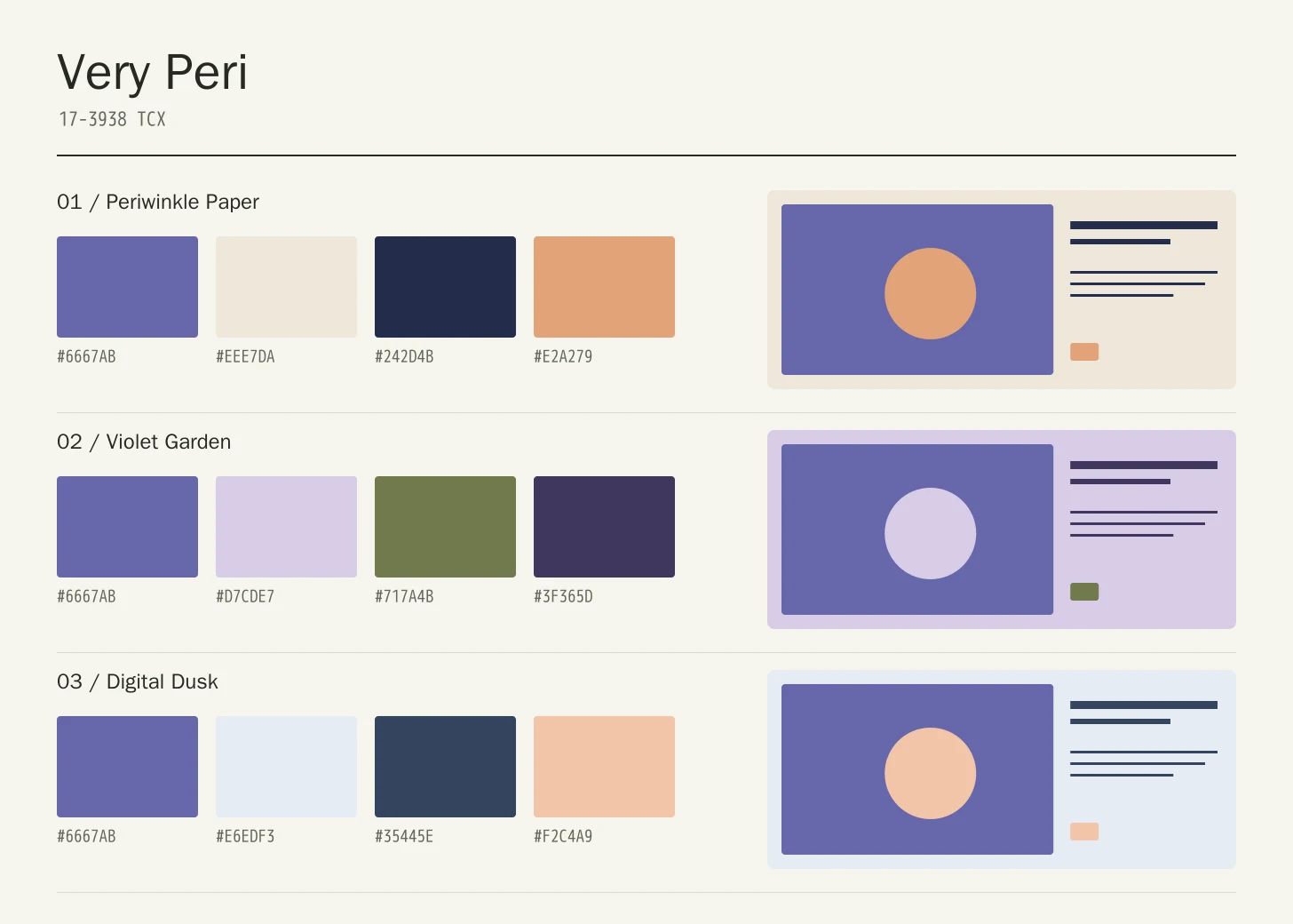
The examples here use the shade for a creative studio, a patterned textile, and a digital learning product. Give it a consistent role within each system so it does not drift between decoration, navigation, and status without a clear reason.
The HEX, RGB, and illustration on this page are screen approximations. Use a current physical Pantone reference to select and approve the material-specific production target.[2]
Key color facts
- Pantone selected PANTONE 17-3938 Very Peri as its Color of the Year for 2022. This provides a documented historical context for the reference.[1]
- The TCX reference identifies Very Peri within the Fashion, Home + Interiors Cotton library. It is distinct from a Solid Coated or Uncoated ink reference; keep the system and suffix when specifying the color.[2]
- WCAG 2.2 sets a minimum contrast of 4.5:1 for normal text and 3:1 for large text under Success Criterion 1.4.3. Evaluate the actual digital foreground and background together.[3]
- For this catalog HEX approximation: Calculated contrast with black: 4.09:1.
Calculated screen contrast
#6667AB
- Relative luminance
- 0.155
- Black contrast
- 4.09:1
- White contrast
- 5.13:1
Recommended use cases
Creative studio identity
Try a periwinkle field with warm paper, dark navy typography, and a small apricot detail. Keep the strongest geometric shape consistent across business cards, project covers, and exhibition labels so the identity has structure beyond the unusual color.
Consideration: Make sure the identity remains recognizable in a single-color version and at the smallest intended reproduction size.
Patterned textile
Use the violet-blue for the principal motif, with pale lavender spacing and an olive counterpoint. Vary the scale of the motif rather than increasing the number of colors whenever the pattern needs another layer of complexity.
Consideration: Review pattern repeats at full scale; a balanced small swatch can become busy when repeated across a large garment or curtain.
Digital learning product
Give periwinkle a supporting role in lesson headers and selected panels while dark navy carries reading text. A restrained apricot detail can separate progress highlights from the main navigation without requiring an entirely different visual language.
Consideration: Test normal text, icons, keyboard focus, and selected states against their implemented backgrounds rather than assuming the main hue is accessible.
Color palette ideas
Periwinkle Paper
Very Peri
#6667AB
Warm Paper
#EEE7DA
Navy Ink
#242D4B
Apricot
#E2A279
Very Peri: Give Very Peri the main field or identifying shape.
Warm Paper: Leave lighter intervals around longer information and open margins.
Navy Ink: Anchor the strongest labels, outlines, or structural details here.
Apricot: Repeat this accent sparingly to connect differently sized elements.
Warm Paper balances the cool featured hue, while Navy Ink provides precise anchors for information. Apricot is deliberately limited to small details that bring the temperature forward without turning the composition into an equal contest between two accents.
Violet Garden
Very Peri
#6667AB
Lavender Mist
#D7CDE7
Olive Leaf
#717A4B
Deep Violet
#3F365D
Very Peri: Use Very Peri on the featured object or motif.
Lavender Mist: Create a quieter neighbor around the principal colored surface.
Olive Leaf: Give this companion a distinct, limited supporting assignment.
Deep Violet: Ground the family through consistent placement of smaller details.
Lavender Mist extends the violet family and Olive Leaf interrupts it with a muted green. Deep Violet grounds the arrangement. Different motif sizes and open spacing are more useful here than adding several more similarly saturated colors.
Digital Dusk
Very Peri
#6667AB
Ice
#E6EDF3
Slate Navy
#35445E
Pale Peach
#F2C4A9
Very Peri: Repeat Very Peri at a consistent point across layouts.
Ice: Leave room around imagery without adding competing emphasis.
Slate Navy: Adjust this supporting area beside the featured color.
Pale Peach: Distinguish fine information through value, placement, and foreground contrast.
Ice opens the layout, Slate Navy supports extended reading, and Pale Peach provides a small warm signal. Use the featured hue to connect sections, then allow spacing and typography to carry the more detailed information hierarchy.
Production guidance
- Specify the full PANTONE 17-3938 TCX textile reference. Use a current physical Pantone sample; a screen preview cannot approve an ink or another material.[2]
- For a patterned collection, approve both the color sample and the full repeat. Document the intended fabric, pattern scale, and finishing process so a later supplier change does not silently alter the relationship between the violet-blue and its companions.
- These companion colors are original editorial suggestions. Agree on proportions, surfaces, and acceptance samples before ordering a coordinated collection.
Application example
Frequently asked questions
Is the Very Peri HEX value a production specification?
No. HEX and RGB are approximate screen representations. Specify the full reference and system, then approve a current physical Pantone sample alongside the intended material.
What makes Very Peri different from a plain blue?
Pantone introduced it as a periwinkle blue with a violet-red undertone. For design planning, compare it beside both a blue and a violet reference rather than relying on its name. Its companions will influence which side of that relationship feels more prominent.
How should I check text on Very Peri?
Check the exact background, foreground, and text size under WCAG 2.2. The displayed black ratio is a starting point; transparency, images, and interactive states need separate assessment.
Sources
Pantone Color of the Year 2022: Very Peri
Publisher: Pantone.
Accessed October 13, 2026.
PANTONE 17-3938 TCX Very Peri Color Finder
Publisher: Pantone.
Accessed October 13, 2026.
Web Content Accessibility Guidelines (WCAG) 2.2
Publisher: World Wide Web Consortium.
Published October 5, 2023. Accessed October 13, 2026.