Editorial color profile
Meaning, applications, and color guidance
Ultimate Gray can organize a palette without becoming its only source of character. Let it establish a middle tone between a lighter field and a deeper anchor, then introduce one accent whose role is clear: a marker, an object, or a repeated structural detail.
The directions below explore a modular exhibition, a stationery family, and an understated product interface. Gray becomes more intentional when its neighboring surfaces differ in value and texture; a collection of similar midtones can quickly lose its hierarchy.
The HEX, RGB, and illustration on this page are screen approximations. Use a current physical Pantone reference to select and approve the material-specific production target.[2]
Key color facts
- Pantone selected PANTONE 17-5104 Ultimate Gray together with Illuminating as its Color of the Year for 2021. This provides a documented historical context for the reference.[1]
- The TCX reference identifies Ultimate Gray within the Fashion, Home + Interiors Cotton library. It is distinct from a Solid Coated or Uncoated ink reference; keep the system and suffix when specifying the color.[2]
- WCAG 2.2 sets a minimum contrast of 4.5:1 for normal text and 3:1 for large text under Success Criterion 1.4.3. Evaluate the actual digital foreground and background together.[3]
- For this catalog HEX approximation: Calculated contrast with black: 6.99:1.
Calculated screen contrast
#939597
- Relative luminance
- 0.299
- Black contrast
- 6.99:1
- White contrast
- 3.01:1
Recommended use cases
Modular exhibition
Use gray on repeated structural panels, with chalk information areas, charcoal headings, and selective yellow markers. A consistent gray framework can connect installations by different contributors while leaving room for individual artwork and changing exhibit content.
Consideration: Check labels at the intended viewing distance and do not rely on a yellow marker alone to communicate a route or category.
Stationery family
Combine gray covers with warm paper interiors and a narrow olive or rust accent. Keep the gray area consistent across notebooks, folders, and envelopes so small differences in format feel like variations within one deliberate system.
Consideration: Lay out the full family together; similar midtones need enough separation in scale, placement, and texture to remain readable.
Understated interface
Use gray for supporting panels and dividers around near-white content surfaces, with charcoal text and a restrained blue selection color. Let spacing and typography establish hierarchy before assigning additional gray shades to every interface level.
Consideration: Measure borders, icons, text, and focus indicators separately; a useful neutral background does not validate every foreground pairing.[3]
Color palette ideas
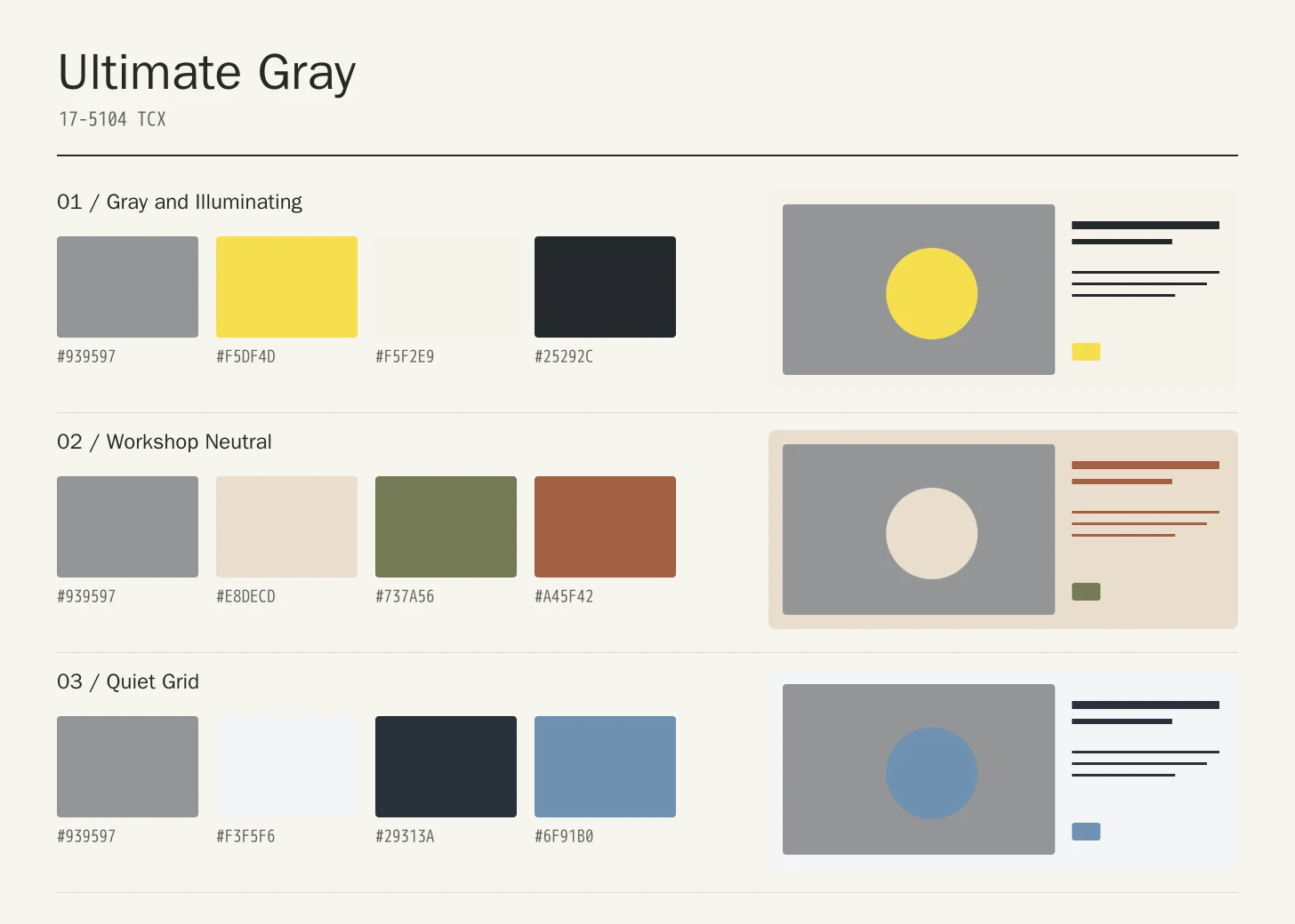
Gray and Illuminating
Ultimate Gray
#939597
Illuminating
#F5DF4D
Chalk
#F5F2E9
Charcoal
#25292C
Ultimate Gray: Give Ultimate Gray the main field or identifying shape.
Illuminating: Use yellow for selected markers within the gray framework.
Chalk: Leave quiet reading areas around the darker information anchors.
Charcoal: Carry detailed labels and decisive structural anchors.
The yellow supplies a concentrated accent while Chalk opens the composition and Charcoal carries the strongest anchors. This is an original arrangement using the two featured 2021 shades, rather than a reproduction of a published brand palette.
Workshop Neutral
Ultimate Gray
#939597
Warm Paper
#E8DECD
Olive
#737A56
Rust
#A45F42
Ultimate Gray: Use Ultimate Gray on the featured object or motif.
Warm Paper: Create a quieter neighbor around the principal colored surface.
Olive: Give this companion a distinct, limited supporting assignment.
Rust: Ground the family through consistent placement of smaller details.
Warm Paper keeps the gray from becoming the whole atmosphere. Olive offers a quieter secondary field, while Rust is reserved for a small identifying detail. Surface differences can make this restrained family feel more varied than its limited colors suggest.
Quiet Grid
Ultimate Gray
#939597
Cloud White
#F3F5F6
Graphite
#29313A
Muted Blue
#6F91B0
Ultimate Gray: Repeat Ultimate Gray at a consistent point across layouts.
Cloud White: Leave room around imagery without adding competing emphasis.
Graphite: Adjust this supporting area beside the featured color.
Muted Blue: Distinguish fine information through value, placement, and foreground contrast.
Cloud White supplies the primary reading canvas and Graphite gives information a clear home. Muted Blue provides selected emphasis. Gray should connect these areas through supporting structure rather than taking over every surface at an equal middle value.
Production guidance
- Specify the full PANTONE 17-5104 TCX textile reference. Use a current physical Pantone sample; a screen preview cannot approve an ink or another material.[2]
- For a modular display, compare the frame coating, printed panel, label stock, and any textile elements side by side. Agree on which surface establishes the visual reference, then document separately approved specifications for the remaining components.
- These companion colors are original editorial suggestions. Agree on proportions, surfaces, and acceptance samples before ordering a coordinated collection.
Application example
Frequently asked questions
Is the Ultimate Gray HEX value a production specification?
No. HEX and RGB are approximate screen representations. Specify the full reference and system, then approve a current physical Pantone sample alongside the intended material.
Was Ultimate Gray the only selection for 2021?
No. Pantone selected Ultimate Gray together with Illuminating for 2021. They are two separate references, not a single mixed color. This page focuses on gray-led compositions; its suggested combinations are editorial options rather than prescribed Pantone palettes.
How should I check text on Ultimate Gray?
Check the exact background, foreground, and text size under WCAG 2.2. The displayed black ratio is a starting point; transparency, images, and interactive states need separate assessment.
Sources
Pantone Color of the Year 2021: Ultimate Gray
Publisher: Pantone.
Accessed October 13, 2026.
PANTONE 17-5104 TCX Ultimate Gray Color Finder
Publisher: Pantone.
Accessed October 13, 2026.
Web Content Accessibility Guidelines (WCAG) 2.2
Publisher: World Wide Web Consortium.
Published October 5, 2023. Accessed October 13, 2026.