Editorial color profile
Meaning, applications, and color guidance
Classic Blue can act as a substantial base without forcing every composition toward a formal corporate mood. Warm paper, pale ceramic tones, or a small coral accent can shift the relationship. Decide whether the blue should hold a broad surface or punctuate a quieter layout.
The examples below approach the shade through a publication identity, a tableware collection, and a digital reading product. Repetition and a clear lighter companion help the blue organize information while leaving room for photography, texture, and changing content.
The HEX, RGB, and illustration on this page are screen approximations. Use a current physical Pantone reference to select and approve the material-specific production target.[2]
Key color facts
- Pantone selected PANTONE 19-4052 Classic Blue as its Color of the Year for 2020. This provides a documented historical context for the reference.[1]
- The TCX reference identifies Classic Blue within the Fashion, Home + Interiors Cotton library. It is distinct from a Solid Coated or Uncoated ink reference; keep the system and suffix when specifying the color.[2]
- WCAG 2.2 sets a minimum contrast of 4.5:1 for normal text and 3:1 for large text under Success Criterion 1.4.3. Evaluate the actual digital foreground and background together.[3]
- For this catalog HEX approximation: Calculated contrast with black: 2.37:1.
Calculated screen contrast
#0F4C81
- Relative luminance
- 0.069
- Black contrast
- 2.37:1
- White contrast
- 8.86:1
Recommended use cases
Publication identity
Use blue for chapter openers, cover geometry, and recurring navigation marks, with warm paper as the main reading field. A restrained coral detail can connect captions or issue numbers without requiring an entirely separate accent system for each edition.
Consideration: Review long-form reading separately from cover design; a successful dramatic opener may be tiring when repeated on every page.
Tableware collection
Try blue on a principal vessel with cream, clay, and muted green supporting pieces. Vary the amount of blue across the collection so some objects anchor the table while others give the composition lighter intervals and tactile differences.
Consideration: Evaluate glaze, edges, and reflected light on finished samples; an isolated flat patch does not represent the complete object.
Digital reading product
Use blue as a navigation anchor around pale content surfaces, with quiet gray secondary panels and selective warm highlights. Keep the visual rule consistent between the index, article, and saved-content views so color helps orientation across the product.
Consideration: Calculate the contrast of all text and controls using their final backgrounds, including hover, focus, selected, and error states.[3]
Color palette ideas
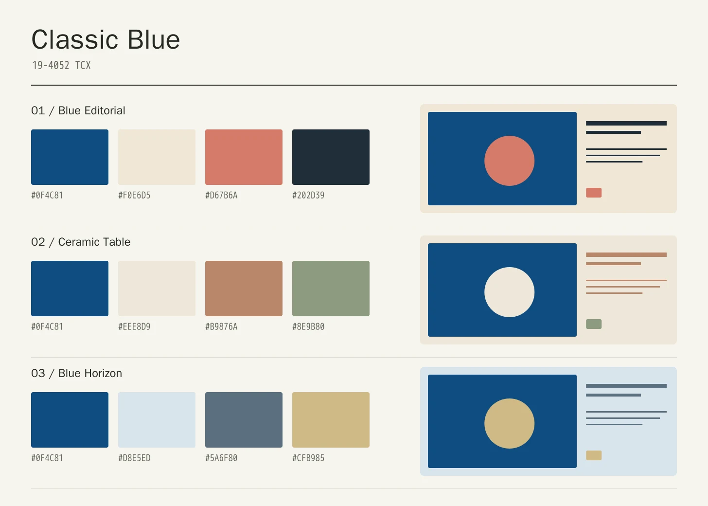
Blue Editorial
Classic Blue
#0F4C81
Warm Paper
#F0E6D5
Coral Accent
#D67B6A
Dark Ink
#202D39
Classic Blue: Give Classic Blue the main field or identifying shape.
Warm Paper: Leave lighter intervals around longer information and open margins.
Coral Accent: Anchor the strongest labels, outlines, or structural details here.
Dark Ink: Repeat this accent sparingly to connect differently sized elements.
Warm Paper gives the blue a broad light partner, Coral Accent adds a small human detail, and Dark Ink carries the densest information. The blue can anchor navigation and large shapes while the page keeps enough quiet area for reading.
Ceramic Table
Classic Blue
#0F4C81
Cream Glaze
#EEE8D9
Clay
#B9876A
Sage
#8E9B80
Classic Blue: Use Classic Blue on the featured object or motif.
Cream Glaze: Create a quieter neighbor around the principal colored surface.
Clay: Give this companion a distinct, limited supporting assignment.
Sage: Ground the family through consistent placement of smaller details.
Cream Glaze lightens the table, Clay introduces a warmer material association, and Sage offers a muted green interval. Let the blue lead one or two substantial objects rather than applying an identical amount to every piece.
Blue Horizon
Classic Blue
#0F4C81
Mist
#D8E5ED
Slate
#5A6F80
Pale Gold
#CFB985
Classic Blue: Repeat Classic Blue at a consistent point across layouts.
Mist: Leave room around imagery without adding competing emphasis.
Slate: Adjust this supporting area beside the featured color.
Pale Gold: Distinguish fine information through value, placement, and foreground contrast.
Mist creates an open field and Slate provides a middle tone between it and the featured blue. Pale Gold supplies selected warmth. Use differences in scale and value to keep the quiet companions from blending into an indistinct background.
Production guidance
- Specify the full PANTONE 19-4052 TCX textile reference. Use a current physical Pantone sample; a screen preview cannot approve an ink or another material.[2]
- For tableware or an interior object, approve the intended surface and shape together. Note the lighting used during review, compare adjacent cream pieces, and check the blue at edges and curves where finish and reflected light become particularly visible.
- These companion colors are original editorial suggestions. Agree on proportions, surfaces, and acceptance samples before ordering a coordinated collection.
Application example
Frequently asked questions
Is the Classic Blue HEX value a production specification?
No. HEX and RGB are approximate screen representations. Specify the full reference and system, then approve a current physical Pantone sample alongside the intended material.
How can Classic Blue feel less formal?
Change its companions and proportions before searching for a new blue. Warm paper and a small coral detail can support a more editorial direction, while clay and sage move the composition toward objects and interiors. Leave the blue one recognizable job within the arrangement.
How should I check text on Classic Blue?
Check the exact background, foreground, and text size under WCAG 2.2. The displayed black ratio is a starting point; transparency, images, and interactive states need separate assessment.
Sources
Pantone Color of the Year 2020: Classic Blue
Publisher: Pantone.
Accessed October 13, 2026.
PANTONE 19-4052 TCX Classic Blue Color Finder
Publisher: Pantone.
Accessed October 13, 2026.
Web Content Accessibility Guidelines (WCAG) 2.2
Publisher: World Wide Web Consortium.
Published October 5, 2023. Accessed October 13, 2026.