Editorial color profile
Meaning, applications, and color guidance
Living Coral can make a small accent feel as deliberate as a broad colored field. Give it a clear relationship to a cooler anchor or a quiet warm neutral, then use repetition to connect the important pieces instead of spreading coral over every available surface.
This profile considers a seasonal identity, soft furnishings, and an editorial interface. The same coral can perform differently in each: a dominant opening shape, a repeated cushion detail, or a compact navigation marker. Choose the job first, then adjust the companions.
The HEX, RGB, and illustration on this page are screen approximations. Use a current physical Pantone reference to select and approve the material-specific production target.[2]
Key color facts
- Pantone selected PANTONE 16-1546 Living Coral as its Color of the Year for 2019. This provides a documented historical context for the reference.[1]
- The TCX reference identifies Living Coral within the Fashion, Home + Interiors Cotton library. It is distinct from a Solid Coated or Uncoated ink reference; keep the system and suffix when specifying the color.[2]
- WCAG 2.2 sets a minimum contrast of 4.5:1 for normal text and 3:1 for large text under Success Criterion 1.4.3. Evaluate the actual digital foreground and background together.[3]
- For this catalog HEX approximation: Calculated contrast with black: 7.70:1.
Calculated screen contrast
#FF6F61
- Relative luminance
- 0.335
- Black contrast
- 7.70:1
- White contrast
- 2.73:1
Recommended use cases
Seasonal identity
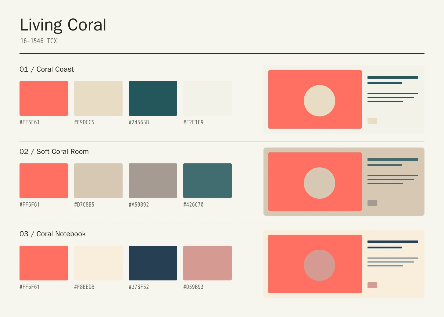
Use coral for one recognizable shape across posters, mailers, and event cards, supported by pale sand and a dark teal information block. Consistent placement lets the color connect formats even when photography and headlines change substantially between applications.
Consideration: Keep date, location, and ticket information distinct from expressive shapes so the identity remains useful at reduced sizes.
Soft furnishings
Pair a coral cushion or woven accent with oat, warm gray, and a deeper blue-green. Repeat the coral in a small secondary object rather than matching every textile, allowing changes in scale and texture to give the room depth.
Consideration: Review the objects across daylight and evening lighting, with neighboring wood, wall color, and upholstery present in the same setting.
Editorial interface
Let coral identify short highlights and section openings around pale reading areas. A deep teal or ink foreground can carry detailed text while the coral supplies a repeated visual rhythm between the index, article, and related-content sections.
Consideration: Measure each implemented foreground and background, and use labels or shapes as well as color to identify interactive elements.[3]
Color palette ideas
Coral Coast
Living Coral
#FF6F61
Pale Sand
#E9DCC5
Deep Teal
#24565B
Foam
#F2F1E9
Living Coral: Give Living Coral the main field or identifying shape.
Pale Sand: Leave lighter intervals around longer information and open margins.
Deep Teal: Anchor the strongest labels, outlines, or structural details here.
Foam: Repeat this accent sparingly to connect differently sized elements.
Pale Sand gives coral a quieter warm neighbor and Deep Teal establishes a cool anchor. Foam opens the composition. The coral can lead selected broad shapes while detailed information stays on surfaces with a more deliberate foreground relationship.
Soft Coral Room
Living Coral
#FF6F61
Oat
#D7C8B5
Warm Gray
#A59B92
Blue Green
#426C70
Living Coral: Use Living Coral on the featured object or motif.
Oat: Create a quieter neighbor around the principal colored surface.
Warm Gray: Give this companion a distinct, limited supporting assignment.
Blue Green: Ground the family through consistent placement of smaller details.
Oat and Warm Gray create a restrained setting for textiles and objects, while Blue Green gives the warm accent a clear counterpoint. Avoid equal amounts of every color; a small repeated coral detail can connect a larger neutral room.
Coral Notebook
Living Coral
#FF6F61
Paper Cream
#F8EEDB
Ink Blue
#273F52
Muted Rose
#D59B93
Living Coral: Repeat Living Coral at a consistent point across layouts.
Paper Cream: Leave room around imagery without adding competing emphasis.
Ink Blue: Adjust this supporting area beside the featured color.
Muted Rose: Distinguish fine information through value, placement, and foreground contrast.
Paper Cream supports extended reading, Ink Blue anchors labels, and Muted Rose offers a softer supporting layer. Keep the coral as the principal warm signal so the two related reds have different roles rather than competing for attention.
Production guidance
- Specify the full PANTONE 16-1546 TCX textile reference. Use a current physical Pantone sample; a screen preview cannot approve an ink or another material.[2]
- For a furnishing project, compare the coral textile with the actual upholstery, paint, and wood samples as one arrangement. Record the approved material and lighting assumptions, then review a finished seam or edge where the accent meets its companions.
- These companion colors are original editorial suggestions. Agree on proportions, surfaces, and acceptance samples before ordering a coordinated collection.
Application example
Frequently asked questions
Is the Living Coral HEX value a production specification?
No. HEX and RGB are approximate screen representations. Specify the full reference and system, then approve a current physical Pantone sample alongside the intended material.
Can Living Coral work outside a seasonal campaign?
Yes, if its role is tied to the design rather than the calendar. A recurring shape, a controlled textile accent, or a consistent navigation marker can give it purpose. Choose supporting colors around the actual use and avoid adding unrelated warm accents by habit.
How should I check text on Living Coral?
Check the exact background, foreground, and text size under WCAG 2.2. The displayed black ratio is a starting point; transparency, images, and interactive states need separate assessment.
Sources
Pantone Color of the Year 2019: Living Coral
Publisher: Pantone.
Accessed October 13, 2026.
PANTONE 16-1546 TCX Living Coral Color Finder
Publisher: Pantone.
Accessed October 13, 2026.
Web Content Accessibility Guidelines (WCAG) 2.2
Publisher: World Wide Web Consortium.
Published October 5, 2023. Accessed October 13, 2026.