Editorial color profile
Meaning, applications, and color guidance
Mocha Mousse is a useful starting point for a brown-led composition that feels considered without becoming heavy. Give the brown a generous cream companion, then decide whether your accent should introduce coolness, fruit-like warmth, or a sharper graphic interruption.
This profile explores three different assignments for the shade: a hospitality identity, a tactile accessories collection, and a quiet editorial interface. The connecting idea is proportion. A brown background, a brown object, and a small brown label need different supporting colors.
The HEX, RGB, and illustration on this page are screen approximations. Use a current physical Pantone reference to select and approve the material-specific production target.[2]
Key color facts
- Pantone selected PANTONE 17-1230 Mocha Mousse as its Color of the Year for 2025. This provides a documented historical context for the reference.[1]
- The TCX reference identifies Mocha Mousse within the Fashion, Home + Interiors Cotton library. It is distinct from a Solid Coated or Uncoated ink reference; keep the system and suffix when specifying the color.[2]
- WCAG 2.2 sets a minimum contrast of 4.5:1 for normal text and 3:1 for large text under Success Criterion 1.4.3. Evaluate the actual digital foreground and background together.[3]
- For this catalog HEX approximation: Calculated contrast with black: 5.45:1.
Calculated screen contrast
#A47864
- Relative luminance
- 0.222
- Black contrast
- 5.45:1
- White contrast
- 3.85:1
Recommended use cases
Hospitality identity
Build a café or small hotel identity around broad brown panels, warm cream information areas, and one restrained blue detail. Repeat the brown in menus and room stationery so recognition comes from a consistent visual rhythm rather than decorative coffee imagery.
Consideration: Keep small text on the lightest or darkest areas, and check each final digital foreground against its actual background.[3]
Accessories collection
Use the brown as the anchor for a bag, notebook, or soft accessory, then let pale stitching and a muted rose lining introduce variation. A limited set of companion colors can connect different products without making every piece look identical.
Consideration: Review the complete assembled object under its intended lighting; edges, hardware, and neighboring materials are part of the decision.
Editorial interface
Try a cream reading surface with brown headings, dark navigation, and occasional pale blue panels. Reserve large brown fields for short introductions or image frames so the layout keeps a clear difference between content, controls, and atmosphere.
Consideration: Measure text and interactive states separately; a successful heading pairing does not validate smaller navigation labels or disabled controls.
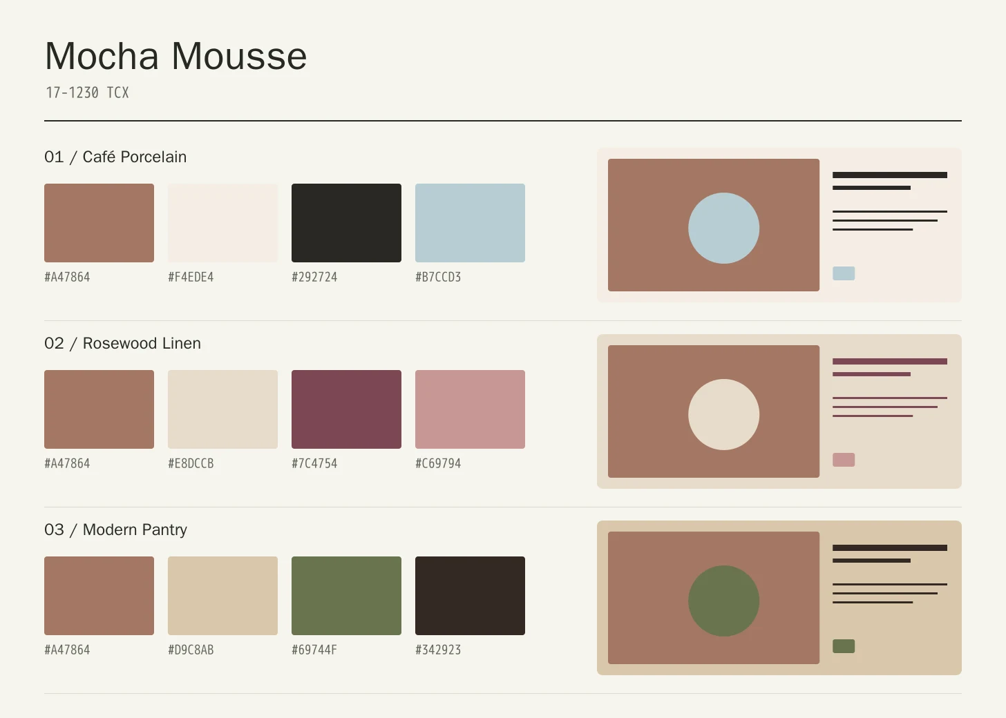
Color palette ideas
Café Porcelain
Mocha Mousse
#A47864
Porcelain
#F4EDE4
Ink
#292724
Mist Blue
#B7CCD3
Mocha Mousse: Give Mocha Mousse the main field or identifying shape.
Porcelain: Leave lighter intervals around longer information and open margins.
Ink: Anchor the strongest labels, outlines, or structural details here.
Mist Blue: Repeat this accent sparingly to connect differently sized elements.
Porcelain makes the brown feel lighter, while Ink gives information a firm anchor. Mist Blue introduces a cool interruption that can distinguish navigation or a small packaging detail without creating a second dominant color.
Rosewood Linen
Mocha Mousse
#A47864
Linen
#E8DCCB
Rosewood
#7C4754
Dusty Rose
#C69794
Mocha Mousse: Use Mocha Mousse on the featured object or motif.
Linen: Create a quieter neighbor around the principal colored surface.
Rosewood: Give this companion a distinct, limited supporting assignment.
Dusty Rose: Ground the family through consistent placement of smaller details.
Linen opens the composition and the two rose tones move the brown toward a softer accessories direction. Keep Rosewood compact and let the lighter rose appear in linings, borders, or secondary surfaces rather than covering every object.
Modern Pantry
Mocha Mousse
#A47864
Oat
#D9C8AB
Olive
#69744F
Dark Cocoa
#342923
Mocha Mousse: Repeat Mocha Mousse at a consistent point across layouts.
Oat: Leave room around imagery without adding competing emphasis.
Olive: Adjust this supporting area beside the featured color.
Dark Cocoa: Distinguish fine information through value, placement, and foreground contrast.
Oat connects the brown to a lighter neutral, Olive adds a restrained green counterpoint, and Dark Cocoa handles the strongest anchors. This is an editorial direction for a coordinated product family, with texture doing some of the visual work.
Production guidance
- Specify the full PANTONE 17-1230 TCX textile reference. Use a current physical Pantone sample; a screen preview cannot approve an ink or another material.[2]
- For a hospitality project, review the menu stock, coated label, fabric accessory, and finished sign together. The same visual intention may need separately approved specifications for each material; keep those decisions attached to the relevant supplier and sample.
- These companion colors are original editorial suggestions. Agree on proportions, surfaces, and acceptance samples before ordering a coordinated collection.
Application example
Frequently asked questions
Is the Mocha Mousse HEX value a production specification?
No. HEX and RGB are approximate screen representations. Specify the full reference and system, then approve a current physical Pantone sample alongside the intended material.
How can Mocha Mousse avoid looking too dark?
Give the brown a lighter companion with enough surface area to matter. Cream can organize long information, while a small cool accent supplies distinction. Test the composition at the size of the real object rather than judging a row of equal swatches.
How should I check text on Mocha Mousse?
Check the exact background, foreground, and text size under WCAG 2.2. The displayed black ratio is a starting point; transparency, images, and interactive states need separate assessment.
Sources
Pantone Color of the Year 2025: Mocha Mousse
Publisher: Pantone.
Accessed October 13, 2026.
PANTONE 17-1230 TCX Mocha Mousse Color Finder
Publisher: Pantone.
Accessed October 13, 2026.
Web Content Accessibility Guidelines (WCAG) 2.2
Publisher: World Wide Web Consortium.
Published October 5, 2023. Accessed October 13, 2026.