Editorial color profile
Meaning, applications, and color guidance
Greenery can give a composition an energetic green focal point without turning every supporting element into another leaf tone. Dark forest, warm paper, or a muted mineral blue can help define its role. Choose a limited area and a consistent placement before expanding the green across the whole system.
This profile explores garden-event graphics, a home-object collection, and food-related editorial pages. The green is a design choice, not proof of environmental benefit or ingredient quality. Use the surrounding information and imagery to explain what the project actually offers.
The HEX, RGB, and illustration on this page are screen approximations. Use a current physical Pantone reference to select and approve the material-specific production target.[2]
Key color facts
- Pantone selected PANTONE 15-0343 Greenery as its Color of the Year for 2017. This provides a documented historical context for the reference.[1]
- The TCX reference identifies Greenery within the Fashion, Home + Interiors Cotton library. It is distinct from a Solid Coated or Uncoated ink reference; keep the system and suffix when specifying the color.[2]
- WCAG 2.2 sets a minimum contrast of 4.5:1 for normal text and 3:1 for large text under Success Criterion 1.4.3. Evaluate the actual digital foreground and background together.[3]
- For this catalog HEX approximation: Calculated contrast with black: 8.36:1.
Calculated screen contrast
#88B04B
- Relative luminance
- 0.368
- Black contrast
- 8.36:1
- White contrast
- 2.51:1
Recommended use cases
Garden event graphics
Use the green on a repeated title shape or directional tab, with warm paper and forest text areas. A compact clay accent can distinguish a workshop category without requiring several competing bright greens throughout the event materials and maps.
Consideration: Avoid relying on green alone to identify a category; combine it with labels, shapes, and a consistent placement rule.
Home object collection
Try green on one planter, tray, or textile accent against pale limestone, dark forest, and muted clay. Let texture and changes in object size supply variety, leaving some pieces neutral so the featured green has space to be noticed.
Consideration: Review the complete group beside actual plants and wood tones; neighboring greens can alter the balance of the arrangement.
Food editorial pages
Use green for section markers and short highlights around a warm white reading canvas, with dark ink and a muted blue companion. Keep food photography on a quieter field so the green does not compete with the ingredients in every image.
Consideration: Do not let the hue stand in for claims about sustainability, nutrition, sourcing, or certification; support those statements with relevant evidence.
Color palette ideas
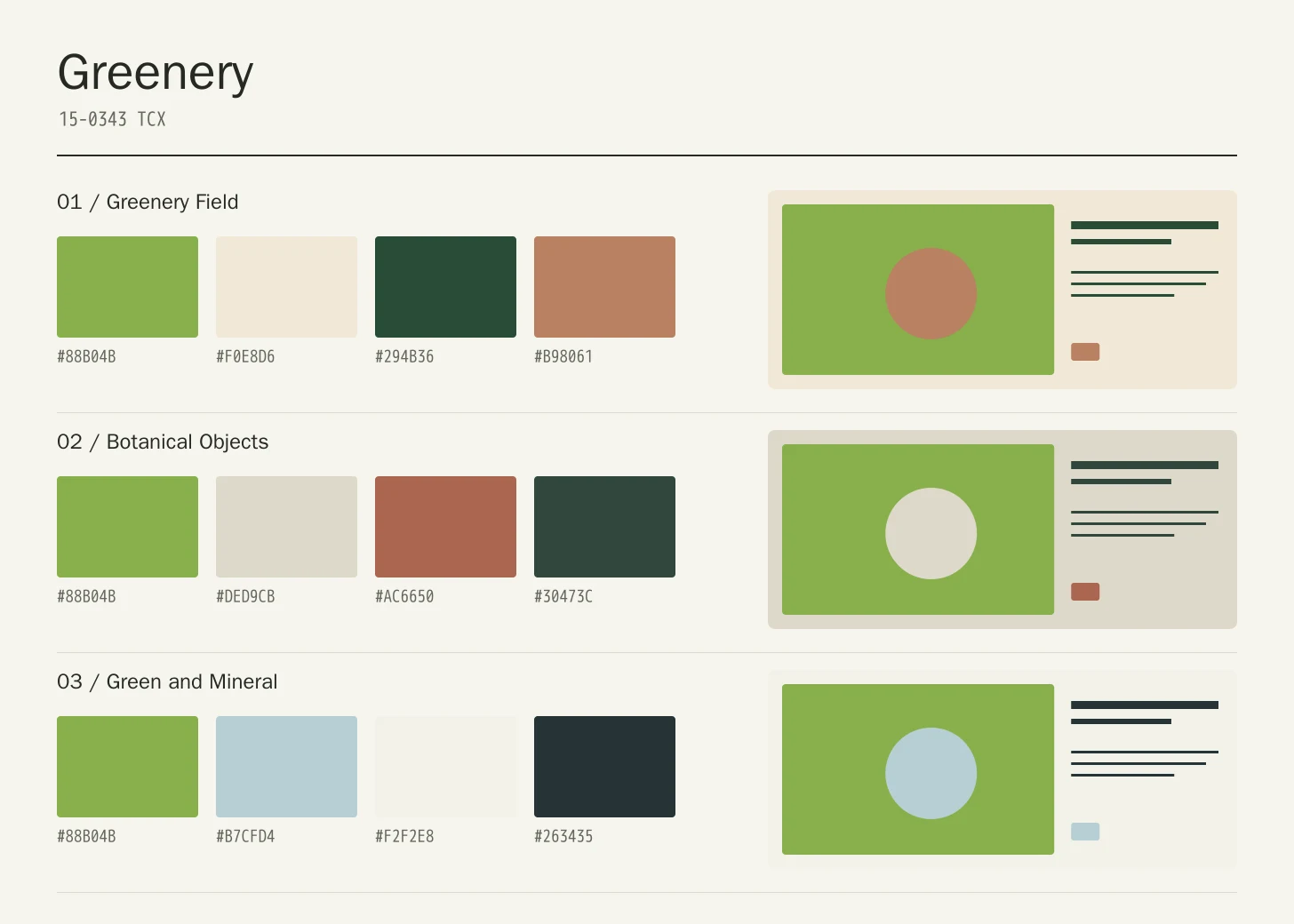
Greenery Field
Greenery
#88B04B
Warm Paper
#F0E8D6
Forest
#294B36
Clay
#B98061
Greenery: Give Greenery the main field or identifying shape.
Warm Paper: Leave lighter intervals around longer information and open margins.
Forest: Anchor the strongest labels, outlines, or structural details here.
Clay: Repeat this accent sparingly to connect differently sized elements.
Warm Paper provides a clear reading field and Forest establishes a strong dark anchor. Clay supplies a small warm counterpoint. The green can mark the most recognizable shapes while the rest of the composition stays quiet enough for changing content.
Botanical Objects
Greenery
#88B04B
Limestone
#DED9CB
Terracotta
#AC6650
Dark Leaf
#30473C
Greenery: Use Greenery on the featured object or motif.
Limestone: Create a quieter neighbor around the principal colored surface.
Terracotta: Give this companion a distinct, limited supporting assignment.
Dark Leaf: Ground the family through consistent placement of smaller details.
Limestone opens the setting, Terracotta introduces a warm material note, and Dark Leaf gives the green a deeper neighbor. Use unequal areas and different object scales so the arrangement feels assembled rather than like four identical blocks.
Green and Mineral
Greenery
#88B04B
Mist Blue
#B7CFD4
Chalk
#F2F2E8
Ink
#263435
Greenery: Repeat Greenery at a consistent point across layouts.
Mist Blue: Leave room around imagery without adding competing emphasis.
Chalk: Adjust this supporting area beside the featured color.
Ink: Distinguish fine information through value, placement, and foreground contrast.
Mist Blue cools the green, Chalk gives imagery breathing room, and Ink handles detailed information. This direction is useful when an energetic green needs a more graphic setting, with the accent repeated in small purposeful markers rather than every panel.
Production guidance
- Specify the full PANTONE 15-0343 TCX textile reference. Use a current physical Pantone sample; a screen preview cannot approve an ink or another material.[2]
- For a home collection, compare the green object with the actual plants, wood, ceramic, and textile pieces that will surround it. Agree on a reference sample and review the assembled arrangement under both daylight and the intended interior lighting.
- These companion colors are original editorial suggestions. Agree on proportions, surfaces, and acceptance samples before ordering a coordinated collection.
Application example
Frequently asked questions
Is the Greenery HEX value a production specification?
No. HEX and RGB are approximate screen representations. Specify the full reference and system, then approve a current physical Pantone sample alongside the intended material.
Does using Greenery communicate an environmental benefit?
The shade can be part of a visual identity, but color alone cannot establish environmental performance. Explain material, sourcing, and certification claims with relevant evidence. In the composition itself, let green identify the project without asking it to substitute for factual information.
How should I check text on Greenery?
Check the exact background, foreground, and text size under WCAG 2.2. The displayed black ratio is a starting point; transparency, images, and interactive states need separate assessment.
Sources
Pantone Color of the Year 2017: Greenery
Publisher: Pantone.
Accessed October 13, 2026.
PANTONE 15-0343 TCX Greenery Color Finder
Publisher: Pantone.
Accessed October 13, 2026.
Web Content Accessibility Guidelines (WCAG) 2.2
Publisher: World Wide Web Consortium.
Published October 5, 2023. Accessed October 13, 2026.