Editorial color profile
Meaning, applications, and color guidance
PANTONE 2121 C offers a pale blue foundation with enough presence to distinguish a surface from white without demanding constant attention. It can support calm information systems, light product families, and stationery that needs color but not visual noise.
As of August 6, 2026, MacRumors reported PANTONE 2121 C as a reference for a possible Light Blue iPhone 18 Pro finish; Apple had not announced that finish.[3]
The lasting design question is how the pale-blue direction works across metal concepts, frosted glass, paper, and calm digital layouts paired with decisive black typography.
Key color facts
- As of August 6, 2026, MacRumors reported PANTONE 2121 C as a reference for a possible Light Blue iPhone 18 Pro finish; Apple had not announced that finish.[3]
- Pantone's Color Finder is the official reference for PANTONE 2121 C; the HEX, RGB, and application image shown here are digital approximations rather than physical production specifications.[1]
- WCAG 2.2 sets minimum contrast ratios of 4.5:1 for normal text and 3:1 for large text under Success Criterion 1.4.3, making measured foreground selection essential.[2]
- For the catalog HEX approximation: Calculated contrast with black: 9.06:1.
Calculated screen contrast
#8FACD8
- Relative luminance
- 0.403
- Black contrast
- 9.06:1
- White contrast
- 2.32:1
Recommended use cases
Calm product surfaces
Use the light blue on a principal metal panel, then frame it with dark controls and a neutral glass surface. The color can define the approachable option in a technical range while remaining compatible with restrained hardware details.
Consideration: Approve metal and frosted glass from separate physical samples, because the concept image and screen chip cannot specify how either manufactured surface should appear.[1]
Stationery systems
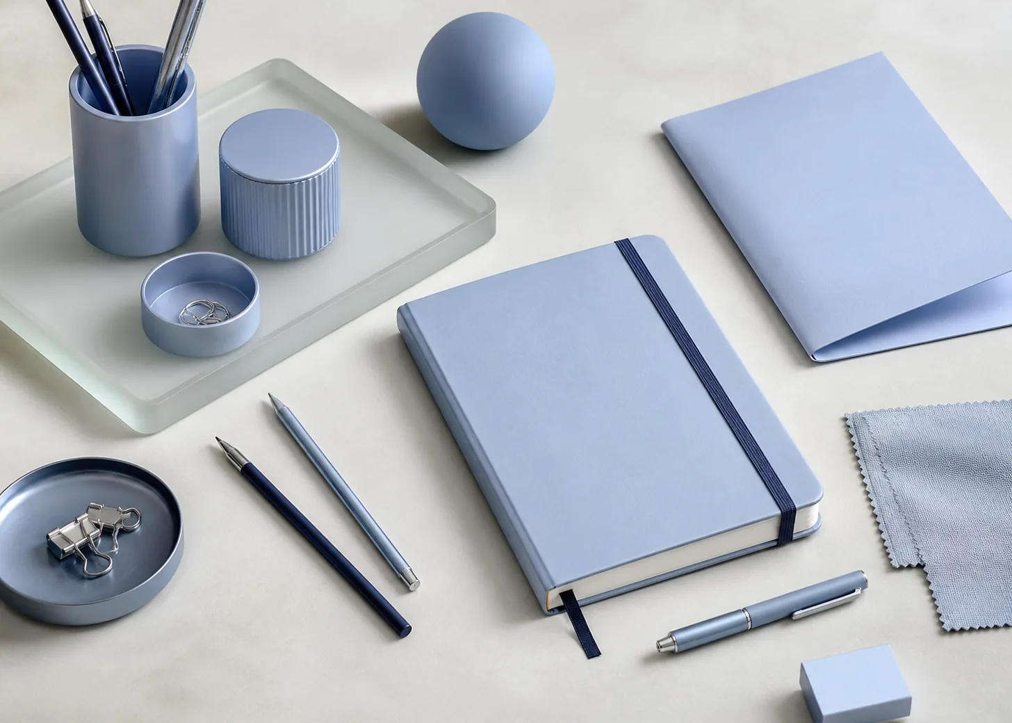
Make 2121 C the cover or divider color, combine it with crisp black type, and leave interior pages mostly neutral. Repeating the blue on tabs or binding details creates continuity without flooding every page.
Consideration: Check the selected paper and proof beside the physical Pantone guide, and document the intended stock rather than approving solely from an RGB layout.[1]
Information interfaces
Apply this pale-blue direction to broad informational surfaces, onboarding panels, or selected chart regions. Black headings and dark icons give the field purpose, while white space prevents the blue from feeling institutional.
Consideration: Test the exact black or dark foreground against the final blue value using WCAG 2.2 criteria, including interactive states and small supporting copy.[2]
Color palette ideas
Clear Desk
Light Blue
#8FACD8
Carbon Type
#171A1F
Paper White
#F5F4F0
Steel Clip
#858C93
Light Blue: Use for covers, organizers, or the broad informational surface that unifies the set.
Carbon Type: Carry primary typography, icons, and boundaries with an unmistakable visual hierarchy.
Paper White: Create a quiet writing and reading field around the pale blue components.
Steel Clip: Connect the palette to hardware, binding, and subdued secondary information.
This practical stationery palette relies on black for clarity and uses two neutrals to separate paper from hardware. The blue remains the memorable organizing color without carrying every functional role.
Frosted Morning
Light Blue
#8FACD8
Mist Glass
#DDE5EA
Slate Edge
#485866
Apricot Note
#E7A67F
Light Blue: Anchor the cool composition with a visible but unaggressive middle value.
Mist Glass: Suggest translucent supporting surfaces and spacious secondary background areas.
Slate Edge: Define edges, controls, and labels with a cooler alternative to black.
Apricot Note: Add a small warm signal where the cool system needs friendly emphasis.
Mist and slate extend the blue through lighter and darker values, while apricot interrupts the cool sequence at a useful point. The result suits calm product storytelling and light digital surfaces.
Modern Primary
Light Blue
#8FACD8
Ink Black
#101113
Tomato Red
#D84A3A
Lemon Paper
#F0D85A
Light Blue: Provide the large, composed field against which stronger accents can remain selective.
Ink Black: Establish maximum visual authority for type, symbols, and compact product details.
Tomato Red: Create one urgent accent for status, navigation, or a small physical component.
Lemon Paper: Add a second lively note for annotation without weakening the dark framework.
The softened blue modernizes a familiar primary-color structure. Black carries most information, allowing red and yellow to function as concise signals rather than competing decorative blocks.
Production guidance
- Use a current physical PANTONE 2121 C guide for specification and approval; this page's HEX, RGB, and image are approximate digital views intended for exploration.[1]
- Prepare separate samples for pale-blue metal, frosted glass, and selected paper. Review them together with black graphic elements so the intended contrast and family relationship remain visible.
- Evaluate the sample under the lighting that governs the project, then record the approved material, surface, and condition. Keep that reference available when later production rounds are compared.
- Keep all iPhone language explicitly unconfirmed and dated August 6, 2026. The MacRumors report is context for a possible finish, not evidence of an Apple product announcement.[3]
Application example
Frequently asked questions
Is PANTONE 2121 C a confirmed iPhone finish?
No. MacRumors reported the reference in connection with a possible Light Blue iPhone 18 Pro finish, but Apple had not announced it as of August 6, 2026 and the plan could change.
Why does black typography work well in this concept?
The pale blue gives a dark foreground room to establish clear hierarchy. Use the calculated ratio as an initial screen check, then validate the final colors, text size, and weight against WCAG 2.2.
Can one digital value specify metal, glass, and paper?
No. Use the screen value for layout exploration, but approve each real material from an appropriate sample with the current physical Pantone reference available to guide the intended color direction.
Sources
Publisher: Pantone.
Accessed August 6, 2026.
Web Content Accessibility Guidelines (WCAG) 2.2
Publisher: World Wide Web Consortium.
Published October 5, 2023. Accessed August 6, 2026.
Four iPhone 18 Pro Colors Revealed in New Report
Publisher: MacRumors.
Published April 17, 2026. Accessed August 6, 2026.