Color News
iPhone 18 Pro Pantone Colors Rumored: Dark Cherry, Light Blue, Dark Gray, and Silver
A Pantone-backed look at the rumored iPhone 18 Pro palette, from Dark Cherry to Silver, and what each finish could mean in real materials.
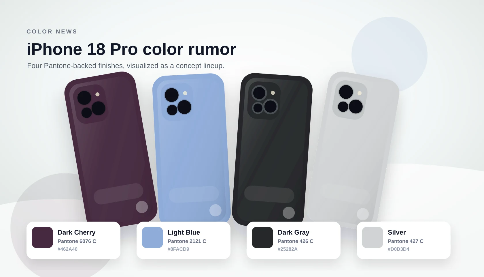
Apple has not announced the iPhone 18 Pro lineup yet, but supply-chain reporting has already turned the color conversation into the most interesting part of the rumor cycle. The current claim is specific: iPhone 18 Pro and iPhone 18 Pro Max are being tested in Dark Cherry, Light Blue, Dark Gray, and Silver, with Pantone 6076 C, Pantone 2121 C, Pantone 426 C, and Pantone 427 C attached to the reported finishes.
That does not make the palette final. The reports describe colors in development before mass production, so Apple could still tune the coatings, rename the finishes, or drop one option. Even so, the Pantone codes give designers and color-watchers a useful way to understand the mood of the set before official product photography arrives.
The Rumored Palette
The group reads like a classic Pro lineup with one expressive anchor. Dark Gray and Silver cover the conservative end of the range, Light Blue adds a familiar cool option, and Dark Cherry gives Apple a deeper, more fashion-led signature color than the brighter Pro finishes of recent years.
| Rumored finish | Pantone reference | Color character |
|---|---|---|
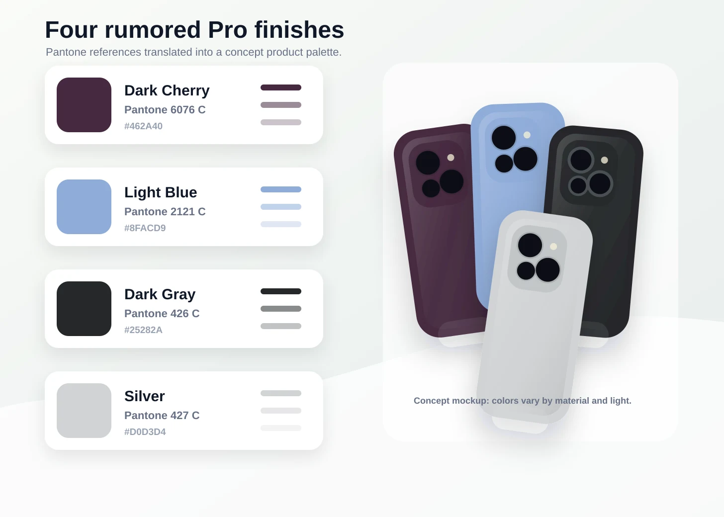
| Dark Cherry | Pantone 6076 C | A deep wine-purple tone that feels richer and quieter than a bright product red. |
| Light Blue | Pantone 2121 C | A soft blue with enough gray in it to stay polished rather than playful. |
| Dark Gray | Pantone 426 C | A near-black graphite direction that should make the camera plateau feel more monolithic. |
| Silver | Pantone 427 C | A light neutral that keeps the lineup familiar and pairs easily with clear or pale cases. |
Why Dark Cherry Is the Headliner
Dark Cherry is the shade that changes the emotional temperature of the lineup. Pantone 6076 C sits closer to a dark plum or wine note than a clean red, which makes it feel more like a luxury accessory finish than a bright seasonal color. That matters for a Pro phone: the color can be distinctive without breaking the restrained hardware language.
It also gives Apple a stronger contrast against Silver and Dark Gray. A bright red would fight the industrial shape of the phone; a deeper cherry finish can sit beside black lenses and dark glass with less visual noise. If Apple keeps the shade, the final material will probably decide whether it reads as burgundy, purple, or almost black in indoor light.
What the Pantone References Reveal
Pantone references are useful for discussing color direction, but they are not a promise that a phone will look exactly like a flat swatch. Anodized aluminum, glass inlays, transparent coatings, edge reflections, and studio lighting can all make the same target color feel cooler, warmer, darker, or more metallic.
- Pantone 6076 C gives Dark Cherry its muted wine-purple base rather than a bright red signal.
- Pantone 2121 C makes Light Blue feel airy but still controlled enough for a Pro device.
- Pantone 426 C suggests Dark Gray could land closer to graphite or soft black depending on the finish.
- Pantone 427 C keeps Silver in a pale, modern gray zone instead of a warmer white-metal direction.
What Could Still Change Before Launch
The reporting is unusually color-specific, but it is still pre-launch reporting. Apple often tests more colors than it ships, and Pro models do not always get four options. Color names can also move late in the process: a Pantone-style working reference may become a different retail name once marketing, packaging, and accessory photography are finalized.
- Treat the four finishes as rumored development colors, not confirmed launch colors.
- Expect real hardware to vary from Pantone previews because material and coating change perception.
- Watch whether Apple keeps four Pro finishes or narrows the set before mass production.
- Compare Dark Cherry against recent Apple reds and purples rather than classic PRODUCT(RED).
- Use the Pantone cards as a palette map, not as a guaranteed match for final retail devices.
The Bigger Color Strategy
If this palette holds, Apple would be balancing continuity with a single strong hook. Silver and Dark Gray keep the Pro range safe for buyers who use the phone as a work object. Light Blue gives the lineup a softer, familiar cool tone. Dark Cherry adds the conversation piece: a color that is new enough to be memorable, but dark enough to remain credible on a flagship Pro model.
That is what makes the rumor interesting beyond the names. The palette suggests Apple may be moving away from loud novelty and toward finishes that look richer under material constraints. For color teams, it is a reminder that the best product colors are rarely just hue choices; they are decisions about texture, lighting, camera modules, accessories, and how a device looks after months in a hand or case.
FAQ
Are the iPhone 18 Pro colors confirmed?
No. Apple has not announced the iPhone 18 Pro colors. The current Dark Cherry, Light Blue, Dark Gray, and Silver lineup comes from pre-launch reporting and could change before release.
Why are Pantone codes included in the rumor?
The reported Pantone codes give a shared color reference for the finishes Apple is said to be testing. They help describe the intended direction, but final hardware can look different because of metal, glass, coatings, and lighting.
Which rumored color is the most distinctive?
Dark Cherry is the standout because Pantone 6076 C points to a dark wine-purple finish rather than a bright red. It would give the Pro lineup a richer signature color while staying relatively restrained.