Editorial color profile
Meaning, applications, and color guidance
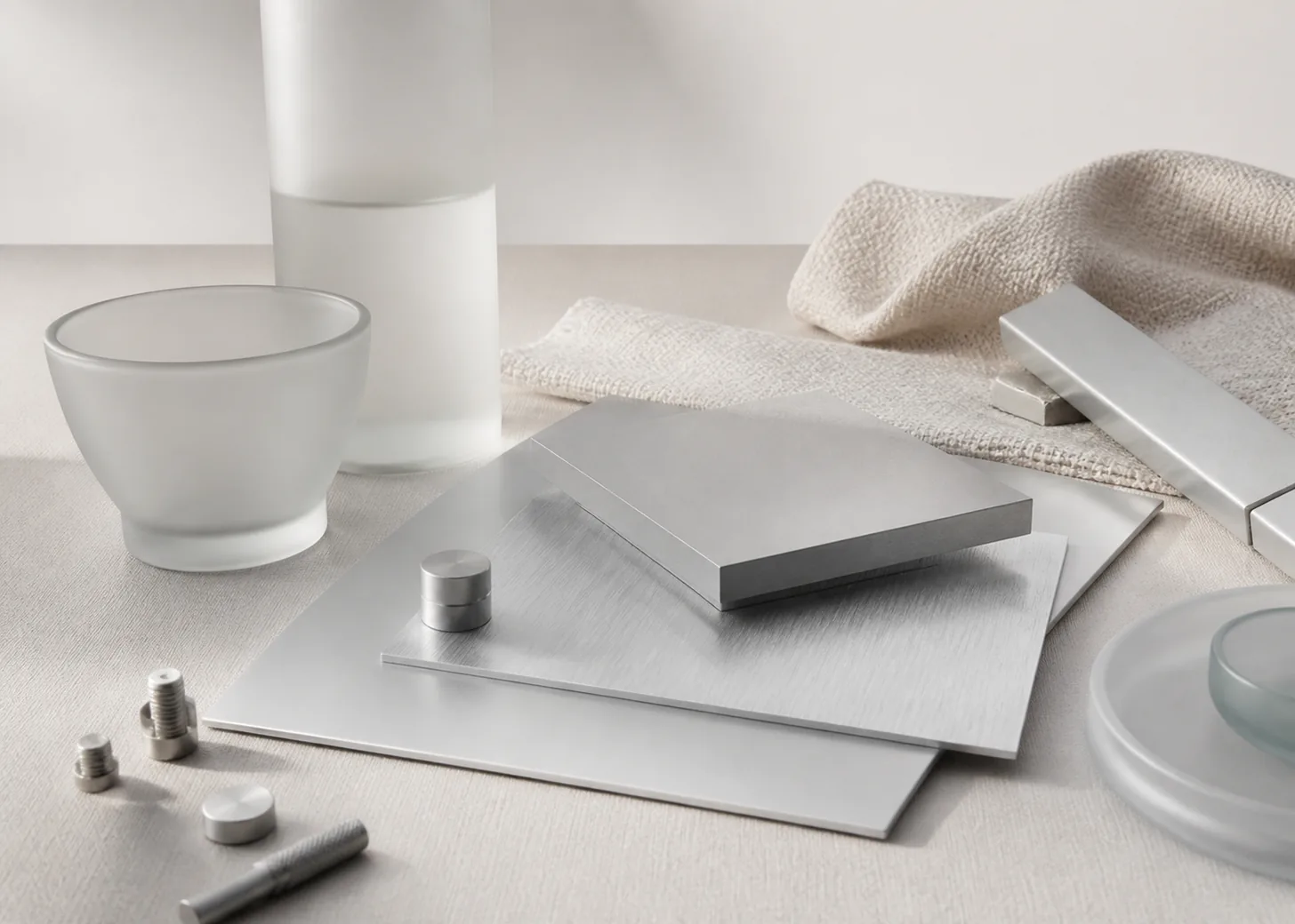
PANTONE 427 C is a pale neutral that becomes interesting through surface behavior rather than saturation. It can read like quiet gray, softly lit metal, frosted glass, or cool textile, making finish and neighboring values central to the design decision.
As of August 6, 2026, MacRumors reported PANTONE 427 C as a reference for a possible Silver iPhone 18 Pro finish; Apple had not announced that finish.[3]
The lasting design focus is giving a light gray enough definition through matte and brushed material directions, dark typography, controlled reflections, and palettes with deliberate temperature contrast.
Key color facts
- As of August 6, 2026, MacRumors reported PANTONE 427 C as a reference for a possible Silver iPhone 18 Pro finish; Apple had not announced that finish.[3]
- Pantone's Color Finder supplies the official PANTONE 427 C reference; the HEX, RGB, and conceptual image here are screen approximations, not substitutes for a physical production guide.[1]
- Under WCAG 2.2 Success Criterion 1.4.3, normal text requires at least 4.5:1 contrast and large text requires at least 3:1, so pale backgrounds need measured dark foregrounds.[2]
- For the catalog HEX approximation: Calculated contrast with black: 13.95:1.
Calculated screen contrast
#D0D3D4
- Relative luminance
- 0.648
- Black contrast
- 13.95:1
- White contrast
- 1.51:1
Recommended use cases
Layered metal products
Use the pale gray across matte and brushed components, then separate moving controls or hardware with one deeper neutral. Repeating the color across different textures creates a coherent family while allowing form to carry the hierarchy.
Consideration: Approve each metal surface as a physical sample and view the group under the intended light; the flat screen value cannot define reflection or finish.[1]
Light packaging systems
Pair 427 C with a near-black wordmark, generous white space, and one material accent such as glass or woven textile. Subtle gray panels can organize information without making the package feel heavy.
Consideration: Keep the gray visibly distinct from the selected white stock, using a proof and an agreed viewing condition instead of relying on monitor separation.
Neutral interface surfaces
Apply the approximation to toolbars, cards, or large secondary panels where pure white needs gentle separation. Dark type and distinct focus states keep the pale gray functional rather than merely decorative.
Consideration: Measure all foregrounds and boundaries against WCAG 2.2, including muted labels that may look elegant but fail when their value sits too close to the background.[2]
Color palette ideas
Brushed Precision
Silver Gray
#D0D3D4
Technical Black
#17191A
Brushed Steel
#8C9295
Clean White
#F7F7F4
Silver Gray: Cover the principal light surface and connect metal, glass, and interface layers.
Technical Black: Carry text, controls, and compact hardware details with decisive contrast.
Brushed Steel: Define secondary metal components and reveal the system's material hierarchy.
Clean White: Create highlights and adjacent paper areas that clarify the silver-gray value.
This narrow neutral set depends on value and texture. Black makes information unmistakable, steel exposes separate parts, and white gives 427 C a visible place between highlight and middle gray.
Cool Glass
Silver Gray
#D0D3D4
Glass Blue
#A8C5D1
Deep Teal
#17464D
Pale Aqua
#E0F0EC
Silver Gray: Provide the calm neutral base for translucent and lightly reflective concepts.
Glass Blue: Suggest cool depth in panels, dividers, or secondary illustration surfaces.
Deep Teal: Ground typography and focused controls with a chromatic alternative to black.
Pale Aqua: Add an airy highlight that keeps the cool family open and spacious.
Blue and aqua make the neutral feel glass-like, while deep teal supplies the visual weight needed for navigation. Keep reflections and gradients restrained so the color system remains clear.
Warm Textile
Silver Gray
#D0D3D4
Mushroom
#A8998B
Oxblood
#65353A
Cream Thread
#EEE5D5
Silver Gray: Anchor the composition with a light neutral that can bridge fabric and hardware.
Mushroom: Warm the palette through woven surfaces, supporting labels, or interior packaging.
Oxblood: Create a concentrated deep accent for stitching, type, or one accessory.
Cream Thread: Soften transitions and distinguish warm textile highlights from cool gray metal.
Warm neutrals prevent 427 C from feeling sterile and make it useful beside fabric. Oxblood gives the light arrangement a memorable focal point without turning the silver gray into background filler.
Production guidance
- Use a current physical PANTONE 427 C guide for color specification; the HEX, RGB values, and application image on this page are conceptual screen approximations only.[1]
- Prepare distinct matte metal, brushed metal, glass, and textile samples. Arrange them together during review so the intended family can be judged across surfaces rather than as isolated chips.
- Record a consistent viewing setup for the approval, including the position of highlights on reflective parts. Repeat the review with final dark graphics and adjacent white components present.
- Date the possible Silver iPhone association August 6, 2026 wherever it appears, and preserve its status as MacRumors reporting unless Apple issues a later announcement.[3]
Application example
Frequently asked questions
Is PANTONE 427 C a confirmed iPhone Silver?
No. MacRumors associated it with a possible iPhone 18 Pro finish, but Apple had not announced the Silver color as of August 6, 2026 and reported development options can change.
Why can a pale gray look different across materials?
Surface and viewing conditions shape the visual result, so treat matte metal, brushed metal, glass, and textile as separate design targets. Compare real samples together under the chosen project lighting.
Is black text suitable for the digital approximation?
The calculated ratio provides a useful first check, but the final design must test its exact black, font size, weight, and states against WCAG 2.2 before accessibility is claimed.
Sources
Publisher: Pantone.
Accessed August 6, 2026.
Web Content Accessibility Guidelines (WCAG) 2.2
Publisher: World Wide Web Consortium.
Published October 5, 2023. Accessed August 6, 2026.
Four iPhone 18 Pro Colors Revealed in New Report
Publisher: MacRumors.
Published April 17, 2026. Accessed August 6, 2026.