Editorial color profile
Meaning, applications, and color guidance
PANTONE 6076 C occupies a restrained plum-wine direction that can appear formal, technological, or intimate depending on its companions. It offers more chromatic depth than a neutral charcoal while keeping the visual weight expected from a dark product surface.
As of August 6, 2026, MacRumors reported PANTONE 6076 C as a reference for a possible Dark Cherry iPhone 18 Pro finish; Apple had not announced that finish.[3]
The lasting design focus is broader: use the plum-wine direction across anodized metal concepts, smoked glass, accessories, packaging, and accessible digital compositions without tying the palette to one product cycle.
Key color facts
- As of August 6, 2026, MacRumors reported PANTONE 6076 C as the reference associated with a possible Dark Cherry iPhone 18 Pro finish; Apple had not announced that finish.[3]
- Pantone's Color Finder provides the official PANTONE 6076 C reference, while the HEX, RGB, and concept image on this page are screen approximations and not physical production standards.[1]
- WCAG 2.2 requires at least 4.5:1 contrast for normal text and 3:1 for large text under Success Criterion 1.4.3, so foreground decisions must be measured rather than guessed.[2]
- For the catalog HEX approximation: Calculated contrast with white: 12.61:1.
Calculated screen contrast
#462A40
- Relative luminance
- 0.033
- Black contrast
- 1.67:1
- White contrast
- 12.61:1
Recommended use cases
Technology accessories
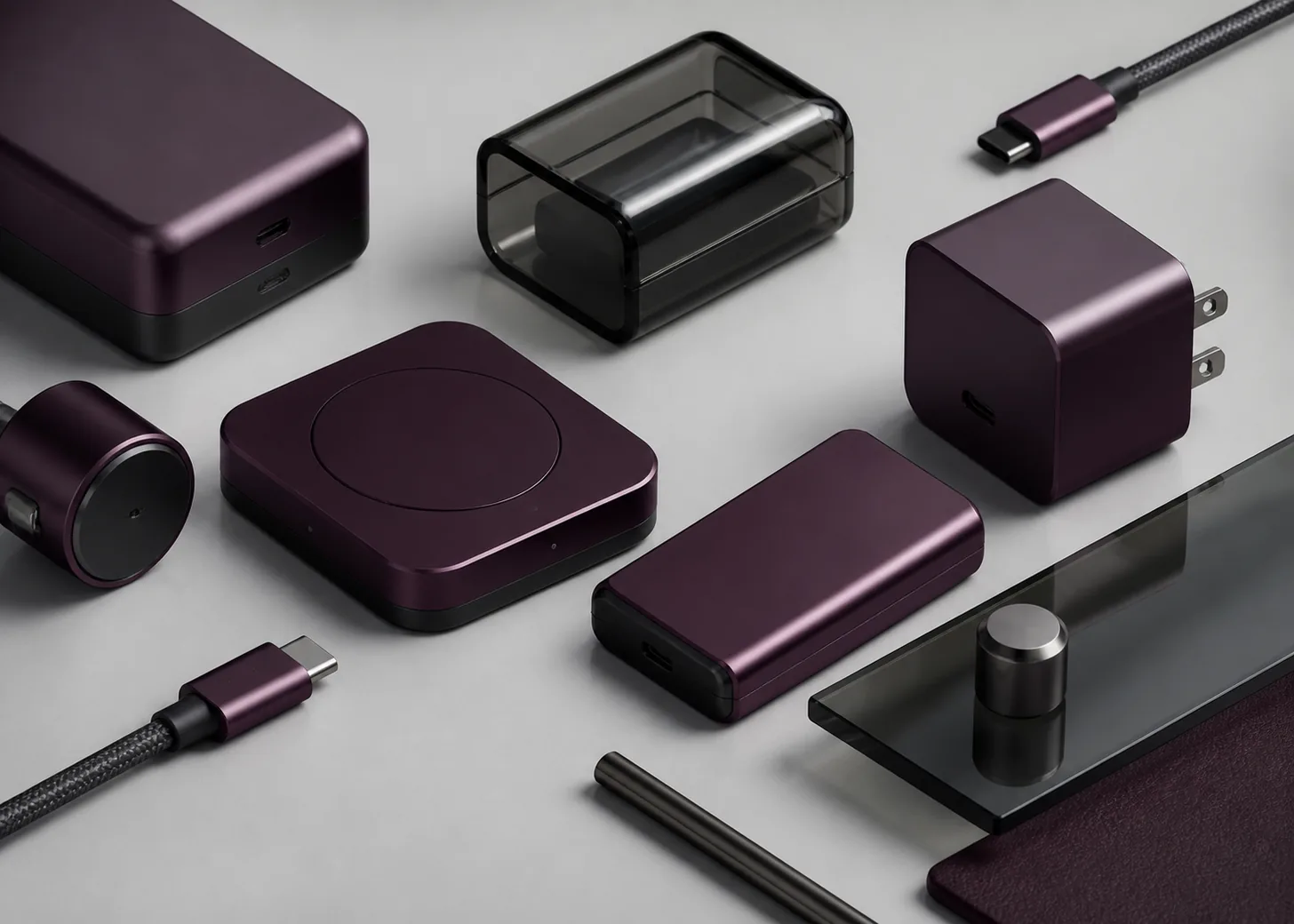
Apply the plum-wine direction to a single accessory family, using dark fasteners and restrained reflective details to preserve a technical mood. The color can act as the expressive option beside neutral products without becoming a bright signal red.
Consideration: Treat anodized metal and smoked glass as separate visual targets, and approve both from physical samples under the light expected in retail and everyday use.
Premium packaging
Use 6076 C as the dominant panel with pale typography, a warm neutral interior, and a small metallic accent. Generous spacing helps the dark color feel intentional while preventing the package from becoming visually dense.
Consideration: Choose the text color only after a contrast test for the final digital value, including its actual size, weight, and every interactive state.[2]
Editorial interfaces
Reserve the approximation for hero panels, selected navigation states, or data highlights against pale gray. A lighter plum can extend the family for secondary surfaces while the deep core retains emphasis.
Consideration: Do not infer accessibility from the color's darkness; test white and black foregrounds at the actual size and weight required by the interface.[2]
Color palette ideas
Smoked Hardware
Deep Plum
#462A40
Smoked Glass
#26262C
Brushed Alloy
#AAA7A8
Soft Screen
#ECE8EA
Deep Plum: Use as the principal shell, package panel, or concentrated digital field.
Smoked Glass: Anchor lenses, glass areas, or typography with a cooler near-black contrast.
Brushed Alloy: Introduce a limited reflective note around edges, controls, or hardware details.
Soft Screen: Provide the pale surface needed for breathing room and readable information.
The palette frames 6076 C as a technology color rather than a cosmetic burgundy. Cool black and alloy sharpen the form, while the pale neutral keeps the deep plum from absorbing the whole composition.
Wine and Stone
Deep Plum
#462A40
Dusty Rose
#B88996
Warm Stone
#C9BFB3
Ink Brown
#332A28
Deep Plum: Carry the distinctive color identity across the most memorable surface or block.
Dusty Rose: Reveal the red-purple family in secondary labels, lining, or supporting graphics.
Warm Stone: Soften the dark anchor and connect it to paper, textile, or ceramic settings.
Ink Brown: Ground fine typography and structural marks without using a colder absolute black.
Dusty Rose exposes the hidden chromatic direction of the featured shade, while stone and brown make the combination feel tactile. Use it when warmth matters more than a strictly industrial impression.
Electric Counterpoint
Deep Plum
#462A40
Ice Blue
#A8D8E8
Signal Coral
#E96B62
Carbon
#17191C
Deep Plum: Set a dark, controlled foundation for one deliberately sharp opposing accent.
Ice Blue: Add cool illumination to indicators, charts, or an accessory detail.
Signal Coral: Use sparingly where the system needs a warmer moment of immediate attention.
Carbon: Separate layers and support controls without diluting the plum signature.
Ice Blue makes the wine undertone feel richer by contrast, and coral offers a controlled warm event. Carbon preserves a technical frame so the palette stays disciplined instead of theatrical.
Production guidance
- Use the current physical PANTONE 6076 C guide as the color reference for approval; the browser HEX, RGB values, and visualization are approximate screen translations only.[1]
- Create separate material samples for dark anodized metal, smoked glass, and coated packaging, then compare them as a family. Approve each surface individually and record the intended coordination criteria.
- Review samples in broad daylight, diffuse indoor light, and a controlled presentation setup. Record which condition governs the final choice so later approvals use the same visual criteria.
- Keep the iPhone association labeled as reporting dated August 6, 2026. Do not present Dark Cherry as an announced product finish unless Apple later confirms it.[3]
Application example
Frequently asked questions
Is PANTONE 6076 C a confirmed iPhone color?
No. As of August 6, 2026, MacRumors associated the reference with a possible Dark Cherry iPhone 18 Pro finish, but Apple had not announced the color and pre-release plans could change.
Should black or white text be used on the screen approximation?
Measure both choices for the exact interface. This page calculates the ratios from the catalog HEX value, but WCAG compliance also depends on text size, weight, and the final foreground and background values.
Will the color look the same on metal and glass?
Treat each proposed surface as its own creative target and compare the finished set together. Aim for a coherent family rather than demanding that unlike objects appear visually identical.
Sources
Publisher: Pantone.
Accessed August 6, 2026.
Web Content Accessibility Guidelines (WCAG) 2.2
Publisher: World Wide Web Consortium.
Published October 5, 2023. Accessed August 6, 2026.
Four iPhone 18 Pro Colors Revealed in New Report
Publisher: MacRumors.
Published April 17, 2026. Accessed August 6, 2026.