Editorial color profile
Meaning, applications, and color guidance
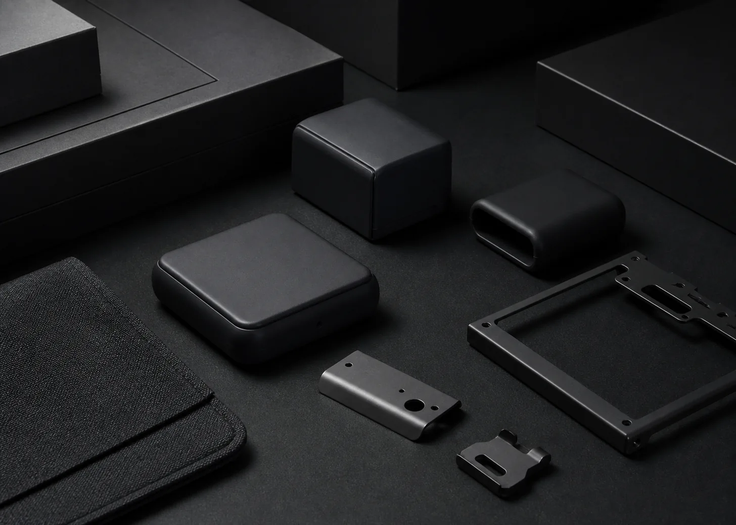
PANTONE 426 C is a near-black graphite direction for projects that need authority without the visual finality of absolute black. Its cool gray character can connect devices, packaging, typography, and hardware into a disciplined system with subtle material separation.
As of August 6, 2026, MacRumors reported PANTONE 426 C as a reference for a possible Dark Gray iPhone 18 Pro finish; Apple had not announced that finish.[3]
The lasting design focus is a disciplined graphite system for devices, rigid packaging, side-lit forms, dark interfaces, and palettes that preserve hierarchy inside a narrow tonal range.
Key color facts
- As of August 6, 2026, MacRumors reported PANTONE 426 C as the reference for a possible Dark Gray iPhone 18 Pro finish; Apple had not announced that finish.[3]
- Pantone's Color Finder supplies the official PANTONE 426 C reference, while this page's HEX, RGB, and application image remain screen approximations rather than physical production specifications.[1]
- WCAG 2.2 defines minimum contrast of 4.5:1 for normal text and 3:1 for large text under Success Criterion 1.4.3, so dark surfaces still require measured foreground choices.[2]
- For the catalog HEX approximation: Calculated contrast with white: 14.83:1.
Calculated screen contrast
#25282A
- Relative luminance
- 0.021
- Black contrast
- 1.42:1
- White contrast
- 14.83:1
Recommended use cases
Graphite device families
Use 426 C as the principal dark shell, then distinguish controls, seams, and lenses with adjacent grays rather than unrelated accent colors. A narrow tonal family can make complex hardware feel composed while retaining visible structure.
Consideration: Review the actual finish under side light and diffuse light. Use the manufactured sample as the approval item and keep the concept image limited to composition planning.
Structured packaging
Apply graphite to rigid boxes or sleeves, with one lighter gray panel and a precise bright accent for navigation. Large matte fields give folds and edges a chance to define the package without decorative clutter.
Consideration: Approve printed or coated stock against the current physical Pantone guide; do not use the browser approximation as the supplier's final color target.[1]
Dark interface framing
Use the approximate value for navigation rails, dashboards, or media frames where a slightly softened black supports long viewing. Separate layers with borders and elevation instead of introducing many competing gray values.
Consideration: Measure white, gray, and colored foregrounds individually against WCAG 2.2, especially for small labels and inactive controls that can lose contrast on graphite.[2]
Color palette ideas
Monolithic Graphite
Graphite
#25282A
Lens Black
#0B0D0F
Machined Gray
#73787C
Panel White
#F1F1EE
Graphite: Form the principal dark surface and establish the product's controlled visual weight.
Lens Black: Deepen selected openings, controls, or typography without covering every dark area.
Machined Gray: Reveal edges and secondary components inside the narrow neutral material family.
Panel White: Supply readable information and a clear opposing surface for key moments.
The palette creates depth through value rather than hue. Black marks the deepest components, middle gray exposes construction, and near-white ensures that information does not disappear into the graphite field.
Graphite Signal
Graphite
#25282A
Safety Orange
#F06A2A
Cool Aluminum
#A7ADB0
Fog Paper
#E5E4DF
Graphite: Carry most packaging and device surfaces as the quiet technical anchor.
Safety Orange: Concentrate attention on one control, status, or opening interaction point.
Cool Aluminum: Connect the dark base to fittings, dividers, and secondary product information.
Fog Paper: Open up manuals, inserts, or light interface panels around the hardware.
A single orange accent gives the neutral system a clear event, while aluminum and fog handle transitions. Limiting the bright hue protects the understated graphite identity.
Cool Night
Graphite
#25282A
Deep Navy
#182736
Icy Blue
#8EC5DD
Stone Gray
#B9B6AE
Graphite: Set the near-black baseline for navigation, packaging, or dark product panels.
Deep Navy: Introduce a subtle cool shift on adjacent surfaces without breaking restraint.
Icy Blue: Illuminate data, indicators, and fine accents against the dark foundation.
Stone Gray: Balance the cool hues with a tactile neutral for paper and textile details.
Navy extends the graphite into a more atmospheric dark range, and icy blue provides a precise luminous accent. Stone keeps the scheme from feeling entirely screen-based or metallic.
Production guidance
- Specify and approve PANTONE 426 C with a current physical Pantone guide; treat the HEX, RGB values, and rendered application image as digital approximations for planning only.[1]
- Prepare separate graphite device and packaging samples, then inspect how seams, edges, and adjacent black parts remain visible under the actual presentation lighting.
- Use side lighting during form review to reveal boundaries, then repeat the evaluation under diffuse light to confirm that the complete object still reads as one intentional dark family.
- Retain the August 6, 2026 date wherever the Dark Gray iPhone association appears, and do not convert the MacRumors report into an Apple-confirmed claim.[3]
Application example
Frequently asked questions
Is PANTONE 426 C a confirmed iPhone Dark Gray?
No. MacRumors linked the reference to a possible iPhone 18 Pro color, but Apple had not announced Dark Gray as of August 6, 2026 and development options may change.
Why choose graphite instead of absolute black?
Graphite can leave room for darker seams, lenses, and controls while preserving a serious overall impression. Use that tonal separation deliberately and confirm the relationship on real samples under relevant light.
Can white text be assumed accessible on 426 C?
No foreground should be assumed accessible. Use the calculated screen ratio as a starting point, then test the final value, font size, weight, and interaction state against WCAG 2.2.
Sources
Publisher: Pantone.
Accessed August 6, 2026.
Web Content Accessibility Guidelines (WCAG) 2.2
Publisher: World Wide Web Consortium.
Published October 5, 2023. Accessed August 6, 2026.
Four iPhone 18 Pro Colors Revealed in New Report
Publisher: MacRumors.
Published April 17, 2026. Accessed August 6, 2026.